
The 2026 Color Trends Women Over 50 Should Try Now
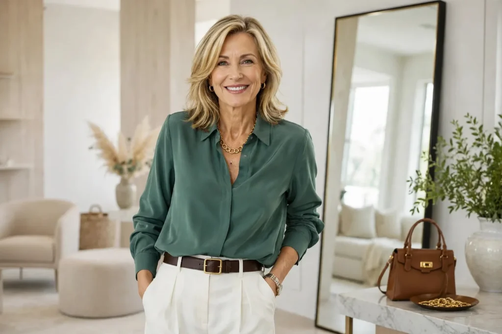
Opening your closet should feel like possibility, not a pop quiz — yet when every hanger holds navy, black, beige and the same “easy” pieces, even getting dressed starts to feel like a risk assessment.
That hesitation does not mean your style has gone dull. More often it means you are simply done with the guesswork: the brights that shout too loud, the pastels that read too sweet, the runway trends that seem designed for someone with a very different life.
Here is the reassuring part: the 2026 color story is gentler than the headlines suggest. Nobody is asking women over 50 to become someone else — these shades are meant to slide into the wardrobe you already own and love.
What follows is not a list of rules but a practical tour: the new neutrals that make everything easier, the brights that work best in small doses, the fabrics that make color look expensive, and a repeatable formula for getting dressed. Every suggestion is built for real routines — errands, lunches, travel, evenings — because a trend you cannot wear on a Tuesday is not a trend worth keeping.
Table of Contents
- How to Tell If a 2026 Color Deserves a Spot in Your Closet
- Begin With the New Neutrals: Soft White, Cocoa, Sage and Olive
- Wear Bright Colors as Accents Instead of a Whole New Personality
- Pick Fabrics That Make Trendy Colors Look Expensive
- Create a Simple Color Formula You Can Wear on Repeat
- Match Your Colors to Where You’re Going
- Tricky 2026 Colors — and How to Make Them Work for You
- Your 2026 Color Game Plan
- Your 2026 Palette at a Glance
- Wearing Bright Colors Well
- Colors That Instantly Look Polished
- Adding Color Without Overdoing It
- A Smart Way to Update Your Wardrobe
- FAQs
- Final Thoughts
How to Tell If a 2026 Color Deserves a Spot in Your Closet
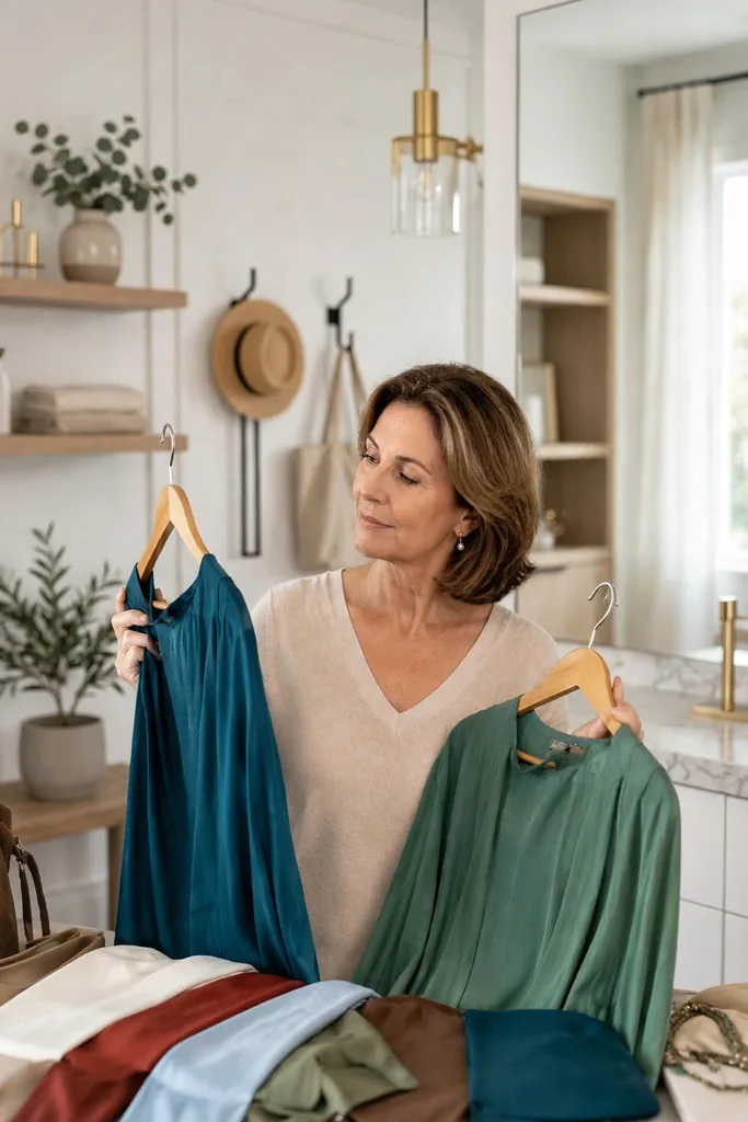
Before falling for any shade, run it through one honest test: will it actually work with the life you lead? A color earns its hanger when it blends with the pieces you already reach for, looks good in the fabrics you like to wear, and multiplies your outfit options — instead of becoming that one “special” item gathering dust.
The authorities are unusually aligned this year. Pantone crowned Cloud Dancer — a soft, breathable white — as its 2026 Color of the Year, and its Spring/Summer 2026 fashion report leans into Alexandrite teal, Lava Falls red, White Onyx and Sage Green. Across the pond, Vogue UK’s summer 2026 edit spotlights turquoise, sky blue, butter yellow, olive green and tomato red.
Read together, those lists say something encouraging: 2026 is not a contest for the loudest color. It is a study in balance. Notice what is missing from those reports, too: there is no single “it” color everyone must buy, and no demand for head-to-toe brights. The through-line is wearability — shades chosen to cooperate with the clothes women actually own. That is good news for anyone whose closet is already full of good basics. Any shade worth adding should do at least one of three jobs for you:
- Wake up the neutrals you already own
- Return warmth to your face
- Give a simple outfit one current, modern note
Color wisdom: The most wearable version of a trend is rarely the loudest one. Tomato red can live happily as a handbag. Butter yellow works beautifully as a soft knit. Turquoise can show up as earrings, a scarf, or a breezy linen shirt — same trend, zero shouting.
Begin With the New Neutrals: Soft White, Cocoa, Sage and Olive
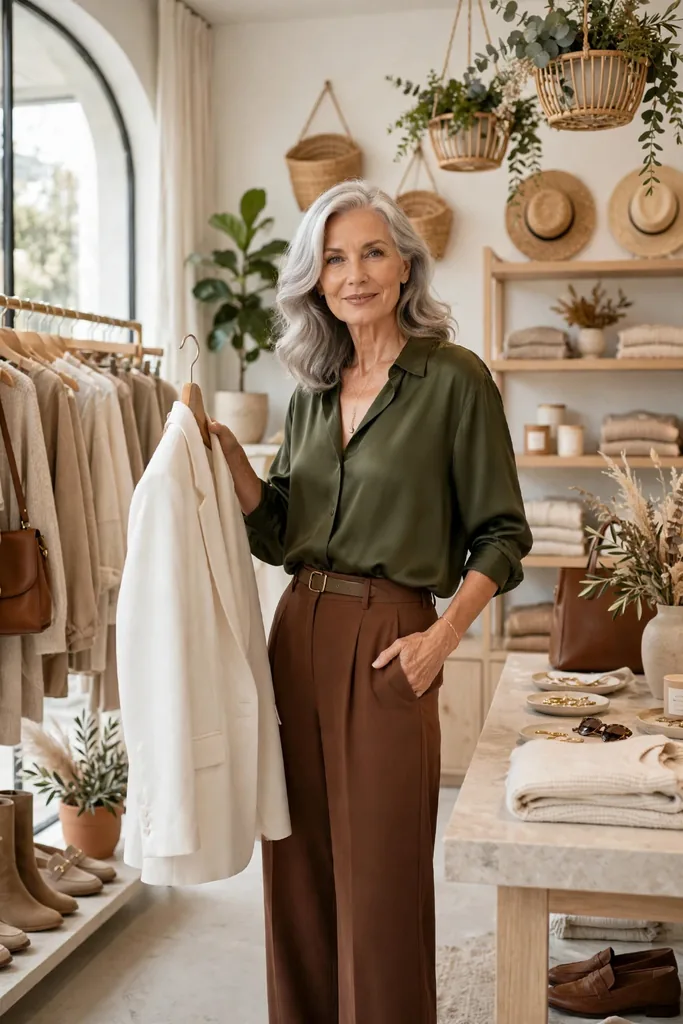
If bold color makes you hesitate, do not start there. The gentlest doorway into 2026 is the new neutral family: soft white, cocoa brown, sage green and olive. They feel current the moment you put them on, yet none of them raises its voice.
What makes them so flattering after fifty is the softness they bring without any weakness. A soft white shirt is far kinder than stark optic white; cocoa brown carries all the polish of black with added warmth; sage and olive introduce real color while staying calm enough for errands, long lunches, travel days and smart-casual evenings.
That is precisely why everyday outfits for women over 50 look instantly more polished in these shades — never overdone, never trying too hard. Part of the magic is lowered contrast: gentler tones around the face soften your whole look, which matters on days when black feels too heavy. Cocoa deserves special mention here, because it solves the most common neutral problem of all: black shoes, black bags and black trousers can quietly turn into a uniform. Swapping just one of those black pieces for cocoa — the shoe, say, or the bag — keeps every bit of the polish while warming the entire outfit. You need not banish black, either — simply give it warmer companions and watch it behave.
The New Neutrals, Decoded
Try this pairing: Style black trousers with a soft white blouse and cocoa loafers instead of a black top with black shoes. The outfit stays neat and pulled-together, but it reads lighter, warmer and noticeably more modern.
Wear Bright Colors as Accents Instead of a Whole New Personality
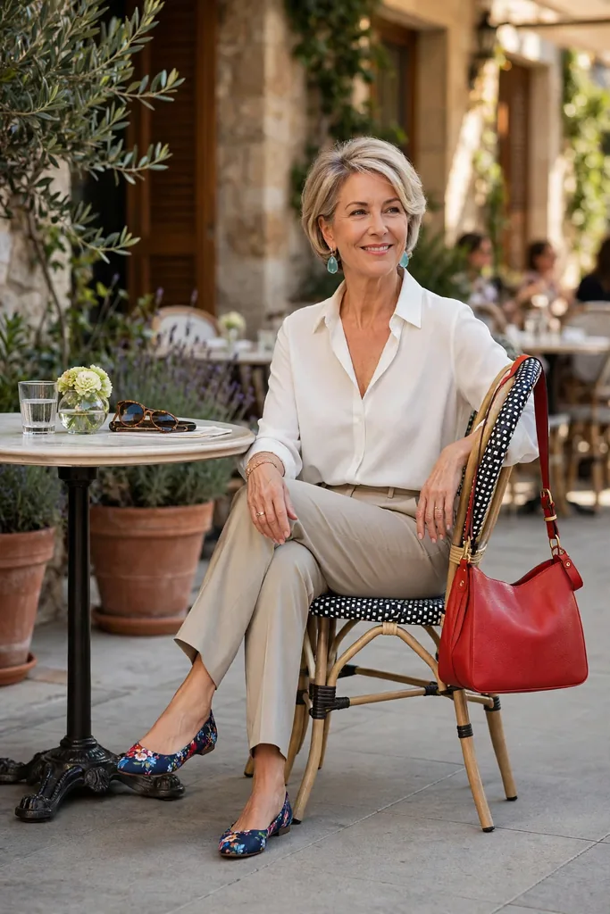
It is completely reasonable to feel wary of bright color. A head-to-toe tomato red dress or a lime jacket might thrill on a runway and feel absurd in the cereal aisle — the setting changes everything, and your instincts know it.
The answer is not to avoid brights but to shrink them. Treat tomato red, turquoise, fuchsia, citrus yellow and vivid blue as accents rather than outfits: a pair of shoes, earrings, a handbag, a scarf, a belt, or a single blouse peeking from under a jacket.
That is the difference between trendy outfits for women over 50 that feel wearable and ones that feel like dress-up — the trend is clearly there, but you remain unmistakably in charge. Accessories make the lowest-risk laboratory for this experiment: an inexpensive scarf in citrus yellow teaches you more about your comfort with the shade than an hour of scrolling ever could, and if you love it, you can graduate to a blouse or a knit next season. Proportion is the whole secret: a strong color in a small dose reads as style, while the same color everywhere can read as costume when you are not used to wearing it.
From Overwhelming to Effortless
Shoe switch: A red ballet flat or a low block heel can make plain jeans and a white shirt look finished — the whole outfit lifts without changing a single other piece.
Pick Fabrics That Make Trendy Colors Look Expensive
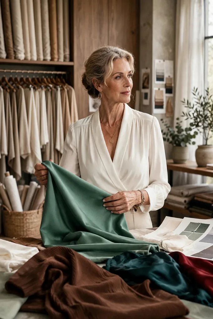
Here is the half of the color story most articles skip: the shade is only fifty percent. The fabric decides whether that shade looks chic or cheap on you.
A vivid color cut in thin, clingy fabric can be unforgiving in all the wrong places. Put the identical color in linen, cotton poplin, suede, leather, satin or a fine-gauge knit, and it suddenly looks deliberate and grown-up. Two women can wear the same red on the same day and get opposite results — one looks polished, the other looks like the color is wearing her.
For 2026, let texture guide you as much as hue. Soft white glows in cotton, linen, denim and knitwear. Tomato red behaves beautifully as leather accessories, crisp shirting, or a smooth cardigan. Sage earns its keep when the cloth has a little backbone — think twill, poplin, or a softly structured jacket. When you are shopping, use the touch test before the mirror test: run the fabric between your fingers, and if it feels substantial, smooth or richly textured, the color will almost always behave. If it feels flimsy or plasticky, no shade — however trendy — will save it.
Fabric First: Where Each Color Shines
Fabric rule: Shine turns the volume up on any color; matte texture turns it down. So when teal feels like too much in satin, try it in a cotton shirt — and when red feels too sharp as a blazer, carry it as a leather bag instead. That is how you tune a trend to your comfort level rather than rejecting it outright.
Create a Simple Color Formula You Can Wear on Repeat
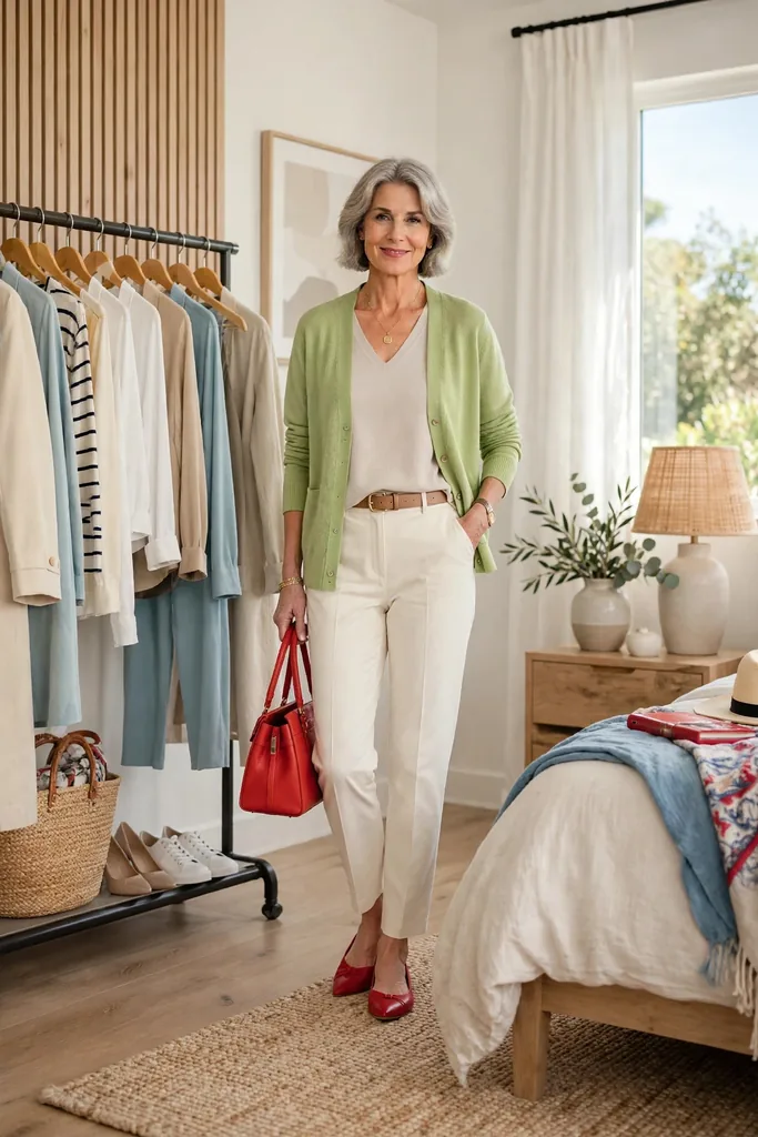
A hardworking wardrobe is not built on endless options. It runs on a handful of formulas you trust without thinking — and color is no exception.
The easiest one for 2026: one calm base, one soft color, one small accent. Ivory jeans with a sage blouse and a red flat. Dark denim with a soft white tee and a turquoise necklace. The base keeps you grounded, the soft color keeps things fresh, and the accent supplies the personality.
Keep a few of these combinations in your back pocket and real-life dressing gets dramatically simpler:
Five Formulas for Real Life
The loveliest part of this formula is that it rarely requires shopping. The base pieces are probably hanging in your closet already — the only update might be a scarf, a shoe, a top or a cardigan in a fresher shade. Once you land on three or four combinations you love, photograph them. On rushed mornings, scrolling your own phone beats staring into the closet — you are simply re-wearing a pairing you already know works.
Budget-wise swap: Before buying a whole dress in a trend shade, test the color cheaply: a scarf or an inexpensive tee. Wear it twice and notice how it feels in daylight, at dinner, and with your usual makeup — then decide.
Match Your Colors to Where You’re Going
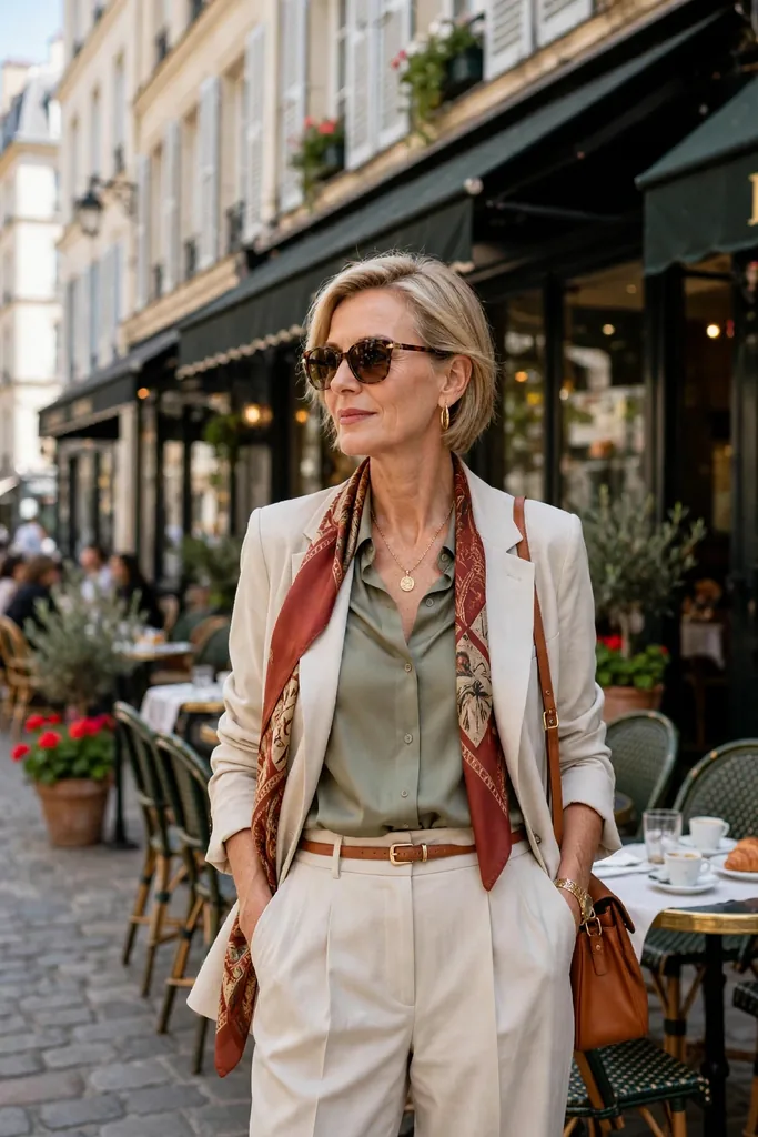
A color that feels perfect on vacation can feel completely wrong in a meeting — and that does not make it a bad color. It just needs a different dose for a different setting.
Think of it as casting: relaxed days call for sky blue, soft white, olive and butter yellow; dressier moments belong to teal, deep red, cocoa and purple. For travel, the winners are the shades that forgive a few wrinkles and get along with just two pairs of shoes.
This is where capsule wardrobe over 50 thinking pays off. You are not collecting random colors; you are choosing shades that work overtime across your week. A soft white blazer layers over jeans, a dress, or black pants. Cocoa loafers step in wherever black shoes feel too severe. A teal blouse elevates plain trousers without demanding much jewelry at all. Packing gets easier with the same mindset: choose one base neutral for the trip — soft white, say, or navy — then bring two accent pieces that both work with it. Three bottoms, four tops and two accents can quietly produce a full week of outfits.
Season switch: In warm months, pair soft white with sky blue and tan. When it cools down, wear that same soft white with cocoa, olive and deep red. One small seasonal shift keeps everything current — no closet overhaul required.
Tricky 2026 Colors — and How to Make Them Work for You
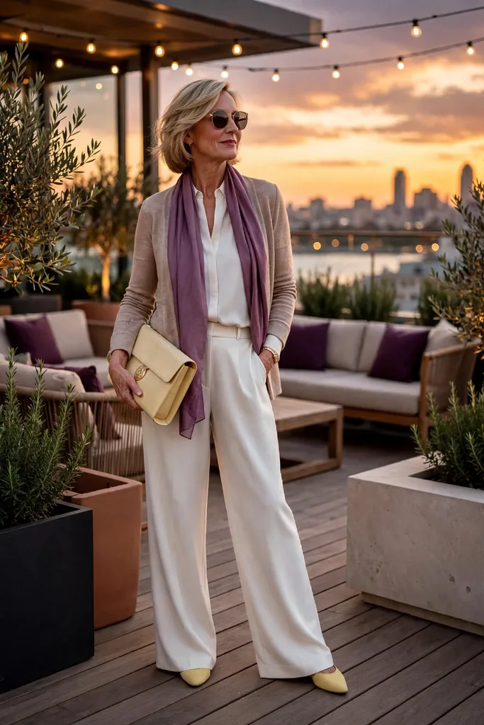
A few 2026 shades need a little more handling than the rest — which is not the same as being off-limits. They simply ask for the right fabric, the right placement, or the right partner.
Lime, vivid yellow and high-shine purple can turn strong very fast. If they excite you, wear them boldly. If they make you hesitate, soften the delivery: try lime as a print detail instead of a solid top, reach for butter yellow instead of neon, and wear purple in suede shoes or a satin clutch rather than a full glossy outfit.
The goal was never to hide from color. The goal is to make color serve you — flattering your face, simplifying your outfits, and making the wardrobe you own feel new again. Placement is the other lever worth pulling: a daring shade kept below the waist or at the feet — trousers, shoes, a bag — is far easier to live with than the same shade framing your face all day. Start low, then work upward as your confidence grows.
Skip this: Do not buy a trend color only because it is everywhere. A shade has to earn its place: it should wake up your face, make outfits easier to build, or make your existing wardrobe feel fresh. If it does none of those, admire it on someone else and move on.
Your 2026 Color Game Plan
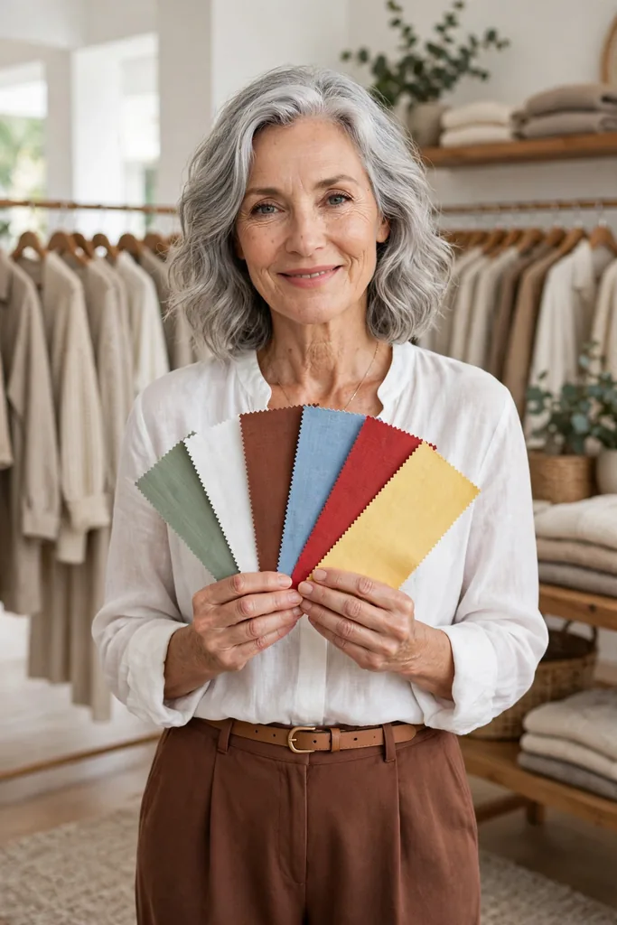
Trends only help when they turn into decisions, so here is the whole 2026 color story compressed into five moves you can actually use. Work through them in order the first time, then treat them as a checklist you revisit each season. Trends will keep shifting, but these five moves — palette, proportion, polish, restraint and strategy — hold steady long after 2026.
Your 2026 Palette at a Glance
The wearable lineup: Soft white, sage green, olive, cocoa brown, sky blue, tomato red, teal, butter yellow and turquoise. Start with one calm shade and one accent — that is the entire strategy in a single sentence.
Wearing Bright Colors Well
The proportion rule: Brights look beautiful at any age. Test red shoes, a teal blouse or a yellow scarf before you commit to any shade head to toe.
Colors That Instantly Look Polished
Softer than black: Cocoa brown, olive, deep teal, navy and soft white pair easily with basics and feel far less harsh than stark black worn near the face.
Adding Color Without Overdoing It
Skip the try-hard trap: Keep the outfit simple and let one color do the work. A white shirt, straight jeans and red flats look more modern than five trends worn at once.
A Smart Way to Update Your Wardrobe
Keep what works: Update around the pieces that already serve you. Add one fresh neutral, one soft color and one accent shade that mixes effortlessly with your existing basics.
FAQs
Which 2026 colors are the most wearable after 50?
Soft white, sage green, olive, cocoa brown, sky blue, tomato red, teal, butter yellow and turquoise lead the most wearable directions. The right pick depends on your wardrobe, your contrast level and how much color you enjoy — begin with one calm shade plus one accent rather than changing everything at once.
Can I still wear bright colors after 50?
Absolutely — bright color flatters at every age. Success lives in placement and proportion: try red shoes, a teal blouse, a turquoise necklace or a yellow scarf before wearing any shade head to toe.
Which colors make an outfit look instantly polished?
Soft white, cocoa brown, navy, olive and deep teal read polished because they partner easily with wardrobe basics — and they are gentler than stark black near the face. Fabric matters too: choose clean cotton, smooth knits, linen, suede or structured blends.
How do I wear trendy colors without looking like I’m trying too hard?
Keep the outfit simple and let a single color do the talking. A white shirt with straight jeans and red flats looks more modern than a complicated outfit juggling five trends — chic outfits for women over 50 usually come from restraint, good fit and one well-chosen detail.
Do I need to replace my wardrobe for the 2026 color trends?
No — updating around what already works is the smarter move. Add one fresh neutral, one soft color and one accent shade that blends with your basics, and you will have more outfits with zero waste.
How do I pick the right shade for my skin tone?
Hold the fabric near your face in daylight: the right shade makes your skin look awake and even, while the wrong one casts shadows or washes you out. Warm undertones usually glow in cocoa, butter yellow and olive; cooler undertones shine in soft white, sky blue and teal.
Where should I start if I feel nervous about color?
Start away from your face — a handbag, shoes or a belt in the trend shade. Once you love seeing it in your outfits, move it closer: a scarf, then a top. Small steps build real confidence.
What if my favorite color isn’t trending in 2026?
Then wear it anyway — with a 2026 accent alongside it. Trends are suggestions, not assignments. A beloved navy dress with butter-yellow earrings, or a favorite black blazer over a sage top, honors both your taste and the season. The most stylish women borrow from trends; they never surrender to them.
Final Thoughts
Color after fifty was never about chasing every trend that rolls by.
It is about rediscovering the shades that make your clothes feel alive again. A soft white shirt, a cocoa shoe, a sage layer or a red accessory can change the entire mood of an outfit — without changing anything about who you are.