
How to Find Your Color Season After 50 (Grey Hair Included)

One morning the mirror tells a new story: the silver at your temples has spread, your complexion reads a little softer than it used to, and the red sweater you adored for a decade suddenly looks… loud. Dressing well past fifty can feel like solving a puzzle with half the pieces missing — especially when you start wondering whether grey hair has quietly reassigned you to a whole new color season.
Here is the reassuring part: going grey does not wipe out your natural coloring, and it certainly does not cancel everything you ever learned about what suits you. It simply asks you to look at four things together — undertone, contrast, depth, and clarity. Once those four fall into place, the everyday decisions (the top, the scarf, the earrings, the lipstick) get dramatically easier.
What follows is a complete home method: how to read your undertone without getting fooled by silver hair, how to measure your contrast in two minutes, how to tell clear from soft and light from deep, and how to turn all of it into a small, wearable palette — plus the testing mistakes that quietly sabotage most DIY attempts.
Table of Contents
- Why the Colors That Flattered You for Years Suddenly Feel Off
- Begin With Your Undertone, Not Your Hair
- Check Your Contrast Before You Pick a Season
- Clear or Soft: Which Finish Loves Your Face More
- Let Depth Point You Toward Your Season
- Guess Your Season Without Getting Stuck on the Label
- Turn It All Into a Wearable Personal Formula
- Small Mistakes That Can Ruin a Home Color Test
- FAQs
Why the Colors That Flattered You for Years Suddenly Feel Off

Your skin’s undertone — that warm or cool current running underneath everything — tends to stay put for life. What shifts is how the whole picture reads. As hair turns silver or white, the contrast between hair and skin often drops, warmth around the face fades a little, and shades that once looked crisp can start to feel either too harsh or oddly flat.
That is why the answer is almost never to give up on color. It is to retune it. A deep chocolate brown that once looked rich might give way to a softer camel; a punchy warm rust might feel better softened into terracotta. And a woman who carried true black beautifully at forty may find charcoal, ink navy, or a cool berry far more flattering once her hair turns silver.
The goal was never to look younger, anyway — it was to look like yourself on a good day. The right colors make your skin look clear and even, your eyes noticeable, and your whole outfit feel connected instead of arguing with your face.
You may notice the same drift in your makeup bag. A foundation that once disappeared into your skin can start reading yellow or pink, and a lipstick that felt like ‘you’ for years can suddenly look separate from your face. That is the same temperature-and-contrast shift at work — and it is another reason to retest your colors rather than assume your old analysis still holds.
Begin With Your Undertone, Not Your Hair
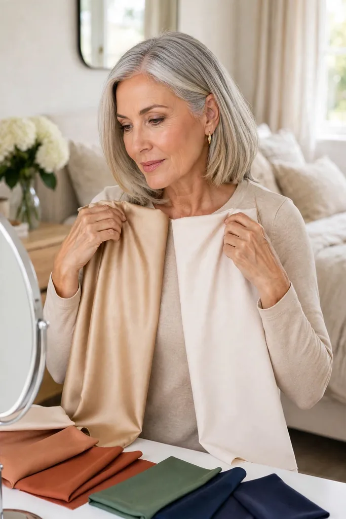
The single biggest myth in color analysis after fifty is that silver hair automatically makes you a cool season. It does not — not on its own. Hair is only one ingredient in the recipe; the undertone of your skin carries far more weight when you are choosing between warm and cool families.
Warm undertones usually feel at home next to cream, camel, olive, peach, warm teal, tomato red, and golden brown. Cool undertones tend to light up beside crisp white, blue-grey, cool navy, raspberry, plum, icy pink, and blue-based reds. If you land somewhere in the middle, neutral undertones can borrow happily from both sides.
Instead of holding up one random shade and asking whether it works, compare close pairs: cream against pure white, coral against raspberry, camel against cool grey, olive against pine green. Look at your face rather than the fabric — the winner is the one that makes your eyes look clearer and your complexion more even, with no extra makeup doing the heavy lifting.
That little side-by-side test shows you what you are actually judging: temperature, not prettiness.
Two more clues can confirm what the drapes tell you: hold a gold and a silver chain against your cheek in daylight and see which one looks like it belongs there, then glance at your inner-wrist veins — greenish usually whispers warm, bluish-purple usually whispers cool. When both agree with your drape tests, trust the answer.
| Try This Pair | Warmer Pick | Cooler Pick |
|---|---|---|
| Light neutrals | Ivory or cream | Crisp white |
| Mid neutrals | Camel | Cool grey |
| Greens | Olive | Pine or blue-green |
| Pink-reds | Coral or tomato | Raspberry or cranberry |
| Brown-purples | Cinnamon | Plum |
Color note:
Run every drape test in genuine daylight, with a fairly bare face. Indoor bulbs — especially warm yellow ones — flatter nearly every shade and can make a cool color read warmer than it really is.
Check Your Contrast Before You Pick a Season
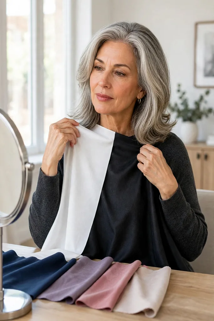
Temperature is only half the story. Once hair goes grey, contrast — the visible distance between your hair, skin, eyes, and brows — often becomes the more useful clue of all.
Picture two women who share the same cool undertone. One has bright white hair, dark brows, and clear eyes, so her contrast is still fairly high. The other has soft silver hair, light brows, and gently blended features, so hers runs low. Despite the matching undertone, they need completely different palettes.
Higher contrast usually carries bolder pairings with ease: ink navy with white, charcoal with raspberry, black with icy pink. Lower contrast tends to prefer gentler meetings — soft navy with dusty rose, mushroom with blue-grey, pewter with muted lavender.
Try this: photograph yourself in natural daylight and flip the image to black and white. You are not judging beauty here, only measuring how much light-dark difference lives between your hair, skin, eyes, and brows. That gap tells you how much contrast your outfits can comfortably carry.
Here is the same idea translated into everyday choices:
| If Your Coloring Reads | Wear Near Your Face | Handle With Care |
|---|---|---|
| Soft and blended | Dusty blue, sage, mushroom, muted berry | Sharp black-and-white pairings |
| Medium contrast | Navy, teal, rose, soft white | Head-to-toe pale neutrals |
| Clear contrast | Cobalt, cranberry, charcoal, crisp white | Very muddy, heavily muted shades |
| Light overall | Pearl grey, light navy, soft aqua | Big blocks of dark brown or black |
None of this is law. If a stronger shade you adore feels a touch harsh, simply move it south — trousers, shoes, handbags, and prints all count as safely away from the face.
Contrast also guides the details people rarely think about: eyeglass frames, handbag hardware, and even hair accessories. A high-contrast woman can carry bold black frames and shiny silver hardware; a low-contrast woman often looks more harmonious with softer tortoiseshell, brushed gold, or matte finishes that echo her own gentler coloring.
Clear or Soft: Which Finish Loves Your Face More
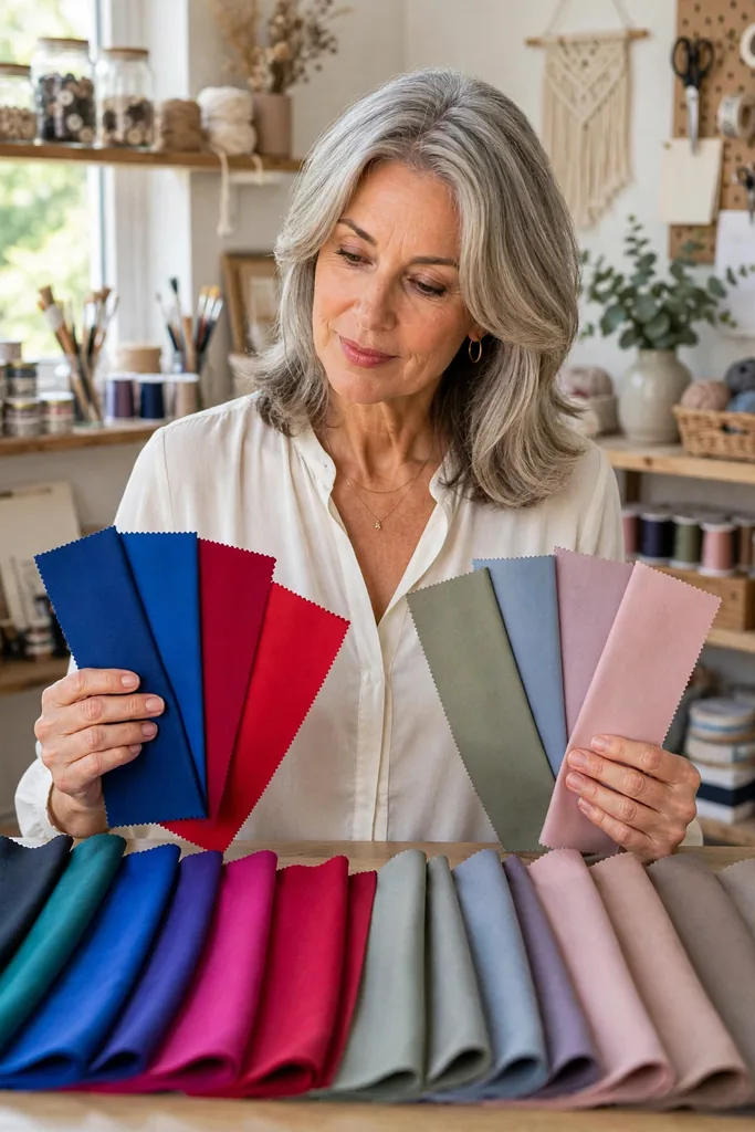
For grey-haired women, few tests pay off like the clear-versus-soft comparison. Clear colors carry more brightness and punch — cobalt, emerald, bright coral, clear turquoise, strong raspberry. Soft colors arrive dusted down — sage, smoky blue, dusty rose, muted teal, mushroom, mauve, soft plum.
Silver hair often makes the softer side feel more connected to the face, but there are no universals here: bright silver hair paired with clear eyes can look spectacular next to rich, clean color. The only way to know your answer is to test it on your own face.
Hold one fan of bright swatches in one hand and one fan of muted swatches in the other, and watch what happens to your face. If the fabric walks into the room before you do, the color is probably too intense. If your face looks tired or seems to vanish beside it, the shade may be too muted. The sweet spot supports your features without stealing the scene.
The same test works for makeup: if you lean clear, a lipstick with real pigment wakes up your face, while softer leanings usually prefer those shades dusted down. With blush, the question is bright versus hazy — not pink versus peach.
Let Depth Point You Toward Your Season
let-depth-point-you-toward-your-season.webp
Next, notice which depth flatters you most — light, medium, or deep. Depth matters enormously now, because silver hair changes how much darkness you actually want framing your face: a deep palette that once looked striking can suddenly feel heavy and tiring.
Before you swap every dark shade for a pastel, try the middle ground first. Navy, medium teal, burgundy, forest green, denim blue, aubergine, and charcoal usually supply enough definition without overpowering softer coloring.
Fit note:
Color never works alone — silhouette is its partner. A big dark turtleneck piles far more visual weight around your face than the very same shade worn as an open-neck blouse or a fine cardigan.
Necklines are your quiet superpower here. A V-neck, a scoop, an open collar, or a softly structured jacket leaves a little breathing room between the fabric and your face, which takes the edge off darker shades. That one small adjustment can keep half your wardrobe in play instead of sending it to the donation bag.
Prints follow the depth rule too: a large deep-toned print weighs as much as a solid dark, while a small airy print on a light ground behaves like a light solid. Love a bold pattern that now feels heavy? Find the same motif scaled down or on a softer background.
Guess Your Season Without Getting Stuck on the Label
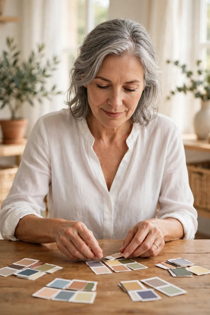
Classic color analysis sorts us into Spring, Summer, Autumn, and Winter — and modern systems add sub-seasons like Soft Summer, Deep Autumn, or Bright Spring. The names are handy shorthand, but the pattern underneath matters far more than the label on top.
Roughly speaking: Spring leans warm and clear; Summer runs cool and softer; Autumn sits warm, earthy, and muted or deep; Winter goes cool, strong, and contrasted. And here is the liberating part — grey hair shows up in every single season. A warm-undertoned woman with silver hair can absolutely belong to Autumn or Spring, while a woman whose grey looks beautiful against cool blue, plum, and charcoal may lean Summer or Winter.
Use the table below as a compass, not a courtroom verdict:
| When You Shine In | You May Lean | Shades Worth Testing |
|---|---|---|
| Warm, fresh, clear shades | Spring | Warm turquoise, coral, cream, leaf green |
| Cool, gentle, muted shades | Summer | Dusty blue, mauve, soft navy, berry |
| Warm, earthy, softened shades | Autumn | Olive, rust, teal, camel, warm burgundy |
| Cool, clear, stronger shades | Winter | Cobalt, cranberry, charcoal, icy pink |
Landing between two seasons is completely normal — real faces rarely fit four neat boxes. Knowing you are ‘mostly Summer with a few Winter brights,’ or ‘warm Autumn, but lighter than the textbook version,’ is far more useful than squeezing yourself into a label that never quite fit.
If you straddle two seasons, build from the overlap: the mid-depth neutrals both seasons share — soft navy, warm taupe, muted teal — become your backbone, and you borrow the brighter or deeper notes only where they earn a place near your face.
Turn It All Into a Wearable Personal Formula
turn-it-all-into-a-wearable-personal-formula.webp
Once temperature, contrast, softness, and depth are clear, compress them into a small personal formula you can actually shop and dress from.
You do not need thirty ‘approved’ colors. Two neutrals, three everyday colors, and one stronger accent will carry you much further than a binder full of swatches.
Formula:
Your best neutral + an everyday color you love + one face-brightening accent. That is the entire equation — everything else is just shopping.
For example: soft navy trousers with an ivory knit and a warm teal scarf — or charcoal jeans, a dusty blue shirt, and berry earrings.
For stylish outfits for women over 50, this kind of repetition is the whole trick: the palette starts mixing itself, and getting dressed stops depending on finding one exact ‘right’ color.
A useful starter palette could look like this:
- Two neutrals: navy and ivory, charcoal and soft white, camel and cream, or mushroom and denim.
- Three core colors: shades you will happily repeat in tops, cardigans, dresses, or jackets.
- One stronger accent: berry, turquoise, coral, cobalt, plum, or red — pick your spark.
- One metal direction: silver, gold, mixed metals, or whichever looks most natural against your skin.
Do not purge clothes simply because they sit outside the palette. Put your most supportive colors closest to your face and let the trickier favorites live on in skirts, trousers, shoes, handbags, or prints — your cost-per-wear stays protected while the wardrobe still feels intentional.
Small Mistakes That Can Ruin a Home Color Test
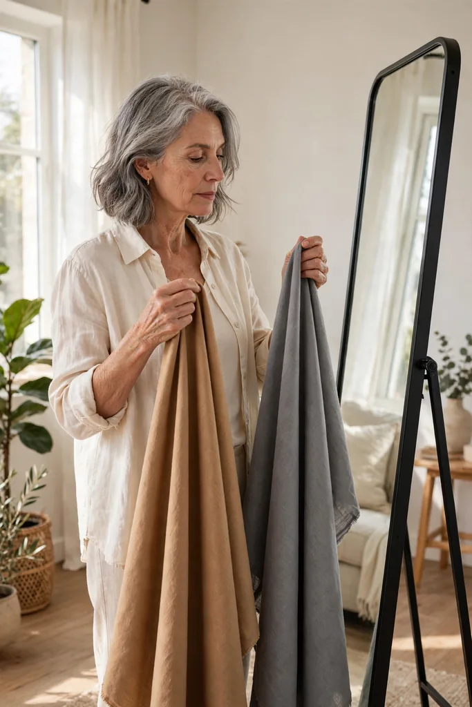
Home color analysis genuinely works — as long as you clear away a few common saboteurs first. Tiny testing errors can make a great color look wrong, or a difficult one look better than it really is.
- Testing under warm bathroom lights: step to a window in daylight so the bulbs stop lying to your skin.
- Judging your hair instead of your face: watch your eyes, skin tone, shadows, and the overall balance.
- Wearing full makeup while testing: heavy blush, bronzer, or lipstick can make unsuitable colors look harmonious.
- Testing only one shade at a time: always compare warm against cool and clear against soft, so a real difference can show up.
You are hunting for patterns, not one dramatic before-and-after moment. A handful of small comparisons will tell you more than any single supposedly definitive test.
One last habit worth adopting: retest once a year, or whenever your hair makes a visible move — fresh silver growth, a new cut that exposes more grey, or a decision to stop coloring altogether. Your season rarely changes overnight, but the fine-tuning (a shade lighter here, a touch softer there) keeps your palette honest as your coloring evolves.