
2026 Color Trends to Refresh Your Look After 50
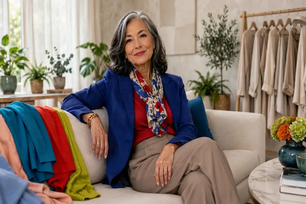
Shopping gets trickier the moment the racks fill with shades that look louder, odder, or nothing like the neutrals hanging in your own closet. Past fifty, most of us stop asking whether we are allowed to wear a color — and start asking whether it fits our days, flatters our skin, and gets along with what we already have.
Which is exactly why the 2026 palette is such good news. Designers are leaning into bolder blues, richer purples, livelier reds and greens, and sunnier yellows — while keeping generous space for cream, navy, gray, and all the quieter shades that hold a wardrobe together.
The strongest stylish outfits for women over 50 never sprint after every new trend. They spend color on purpose — picking shades that light up the face, pair without fuss, and make the everyday basics you already own feel suddenly now, no wardrobe overhaul required.
2026’s Color Mood Is Bolder — Your Wardrobe Doesn’t Have to Be
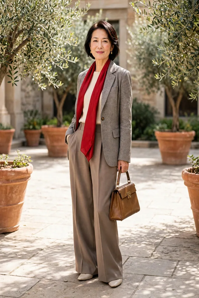
Step into the shops this season and the racks announce it first: color is back, and it is not whispering. Spring made its case with a vivid lineup — lime, violet, scarlet, turquoise, yellow and fuchsia — all grounded by creamy white. Autumn then answered in deeper registers — electric blue, royal purple, red, peach, turquoise and burgundy all carried the story forward into the colder months.
On paper it can sound like a lot to take in. In a real closet, though, one confident flash of a trend shade is plenty. A cobalt sweater over navy trousers does it, as does a plum scarf tossed over a gray wool coat. Layer a turquoise blouse beneath a cream jacket for the same payoff; red flats with jeans and a white tee prove how little it takes.
Forget asking which color is supposedly “best” after 50 — the question that helps is which version of a trend fits your coloring, your closet, your comfort level and the way you dress. If vivid chartreuse sets your teeth on edge, keep it from your face and let a moss-green trouser, handbag, print or shoe carry the idea. And if bright red lights you up, do not shrink it to a timid accent: a red knit or dress has every right to join your personal uniform.
To make the runway-to-wardrobe translation painless, here is a starting grid — find your colors, then look one column right.
| Color family | Wear it as | Ground it with |
|---|---|---|
| Bright and icy blues | a shirt, cardigan or scarf | navy, charcoal, white or denim |
| Royal purple and plum | a knit, blouse or handbag | cream, gray, chocolate or black |
| Red and peach tones | a sweater, jacket or flats | denim, camel, white or navy |
| Chartreuse and moss green | a scarf, shirt or trousers | chocolate, cream or charcoal |
| Cream and soft white | a jacket, knit or trousers | burgundy, navy, teal or tan |
Begin with the row nearest shades already in your wardrobe. Start from the shades you already love and borrow just one neighbor — that almost always feels more natural than assembling a full outfit around a color that has never appealed to you.
Table of Contents
- 2026's Color Mood Is Bolder — Your Wardrobe Doesn't Have to Be
- Icy, Cobalt and Turquoise Blues Wake Up the Basics You Already Own
- Royal Purple and Plum, a Richer Stand-In for Black
- Red, Butter Yellow and Peach Add Warmth Without Stealing the Show
- Green's 2026 Comeback Runs From Vivid Chartreuse to Earthy Moss
- Carbon Gray, Midnight Navy, Cream: The Quiet Neutrals Grounding Every Bold Shade
- Start With a Color You Love and Build Your Palette From There
- FAQs
Icy, Cobalt and Turquoise Blues Wake Up the Basics You Already Own
Blue is a forgiving place to begin, because 2026 refuses to settle on a single shade — icy blue led the spring story while electric blue and turquoise carried it through autumn, so you get to choose your own intensity. Go soft and watery when strong color near your face feels distracting, or lean into cobalt and turquoise for more contrast.
For daily wear, build around pieces you already reach for — a pale-blue button-front shirt, dark straight-leg jeans, and the loafers you live in. The lighter tone up top softens everything around the face, and the dark denim lends enough backbone to keep the whole outfit feeling pulled together.
Cobalt shines brightest against a calm backdrop. Against charcoal trousers, a cobalt crewneck becomes the whole story — a single focal point that needs no supporting cast.
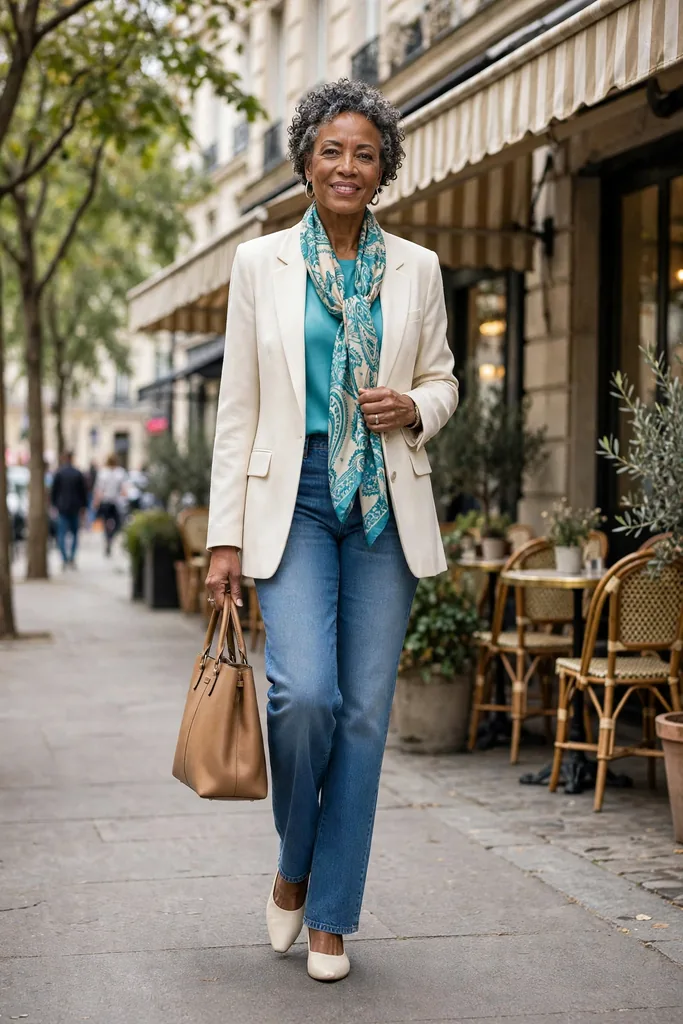
Turquoise is far more polished than its beach-holiday reputation suggests beside deeper neutrals — Vogue’s fall 2026 coverage even showed it on the runway with olive and red, well past summer. Day to day, keep it simpler: a turquoise silk top under a warm ivory blazer with blue jeans and a tan tote, or a turquoise-and-ivory scarf knotted at the neckline — each one sits beautifully against navy, chocolate, cream or dark-wash denim.
Fabric note:
In matte fabrics, saturated blue finds real depth — cotton, wool, linen blends and soft knits are the textures that flatter the shade most. A high-shine finish pushes the same shade toward drama — better for an evening out than a casual daytime wardrobe.
Try this:
gather every blue piece you own and lay it all out on the bed. Chances are the start of a 2026 color story is already hanging there, free of charge.
Royal Purple and Plum, a Richer Stand-In for Black
Purple has outgrown its cameo as a spring fling: royal purple kept resurfacing through the fall and winter 2026 collections, while deeper plum became autumn’s second strong current.
If black, navy, brown and gray do most of the heavy lifting in your closet, start here — this is the gentlest trend family of the season to bring in. Purple carries enough depth to hold its own beside those dark neutrals instead of dissolving into them.
A plum knit over a cream shell with charcoal trousers reads calm yet far more interesting than another black layer — while royal purple against dark denim lifts a plain outfit into something deliberate.
When saturated purple feels like too much near your face, wear it lower — a midi skirt, tailored trousers, loafers, a belt or a structured handbag keep the color in play from a comfortable distance.
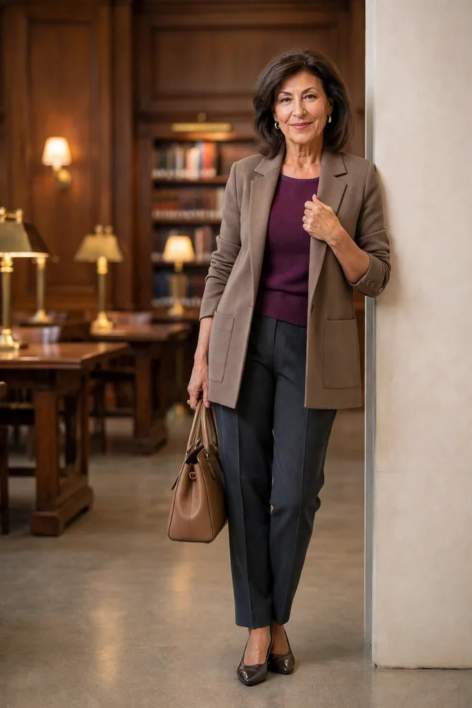
Plum earns its capsule-wardrobe place by behaving almost like a neutral — try a plum knit under a warm taupe blazer with charcoal trousers and a tan handbag. It pairs happily with cream, chocolate, gray, navy, black and most denim washes you already own, which is exactly the kind of easy, no-fuss flexibility a small, hard-working wardrobe needs.
Color note:
Do not hunt down the precise runway shade — whether you land on aubergine, blackberry, wine-purple, plum or amethyst, you will get the same updated feeling, and each option lets you choose the depth that suits your coloring. That freedom is exactly what turns a trend from a restriction into a resource.
Red, Butter Yellow and Peach Add Warmth Without Stealing the Show
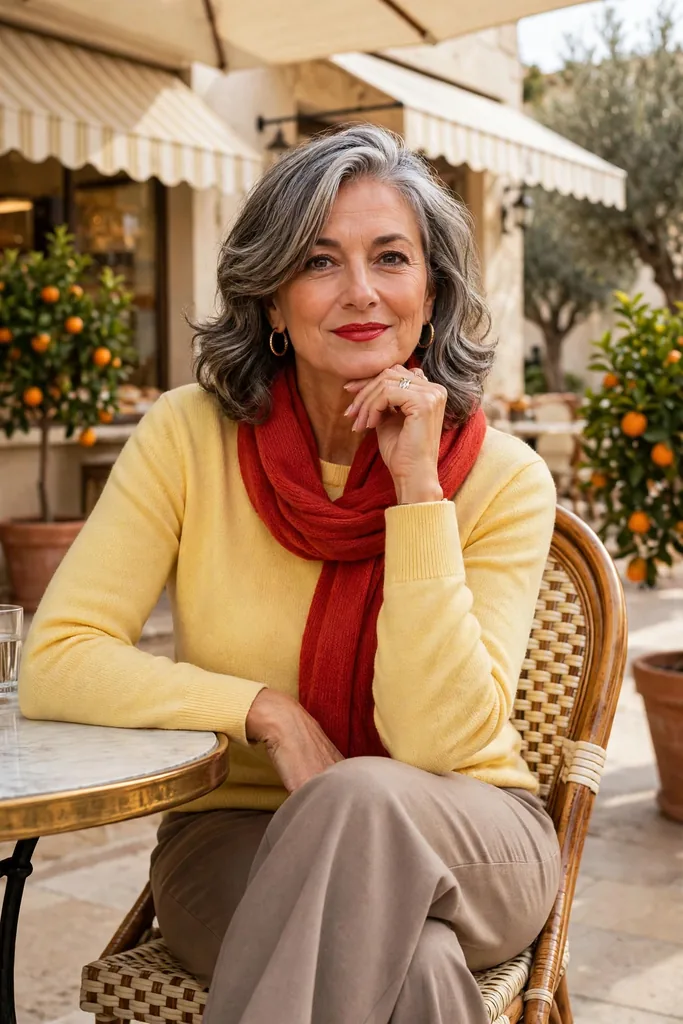
If you want impact this year, look to the warm side of the color wheel — that is where several of the most head-turning shades live. Strong red has refused to leave the spotlight at any point this year, while butter yellow and peach bring that same warmth in softer, easier doses.
Red is the efficiency expert: even a little carries real presence. Few formulas work harder for less — a red cardigan thrown over a white tee and jeans makes even familiar basics look sharper, with practically no effort at all.
Butter yellow plays a different game. At its palest it can stand in for cream, which is why Vogue called it one of the easiest yellows to wear with neutrals — a butter-yellow knit with taupe trousers and a poppy-red scarf shows how naturally it settles in.
Peach lives between pink and orange, which means the garment itself sets the mood. Pair a muted peach blouse with camel or ivory and the result is softness itself. A bolder melon scarf, though, has enough voltage to jolt navy or chocolate awake.
The real skill is choosing how much warmth you enjoy, not reproducing the runway’s version degree for degree.
Warm shades need not read delicate, either. A tomato-red blazer over a white tee with dark jeans looks crisp and modern, not romantic — and that latitude is what good dressing after 50 is about. Treat trends as an invitation to widen your options, never as a new set of rules.
| Common mistake | Smarter move |
|---|---|
| Grabbing a pile of bright pieces in one shopping trip | Let a single colorful knit or accessory join pieces already in your closet |
| Head-to-toe matching: shoes, bag, scarf and top all in the same shade | Echo the shade a single time, then hand the rest over to quiet neutrals |
| Wearing a hard-to-pull-off shade right at your face | Keep the shade but move it down the body — trousers, shoes, a belt or a bag |
| Piling multiple trend colors into one outfit on day one | Build the outfit around a single bold shade, grounding it with navy, denim, cream, gray or brown |
| Picking a shade only because it is having a fashion moment | Pick the version you will genuinely wear on repeat |
Green’s 2026 Comeback Runs From Vivid Chartreuse to Earthy Moss
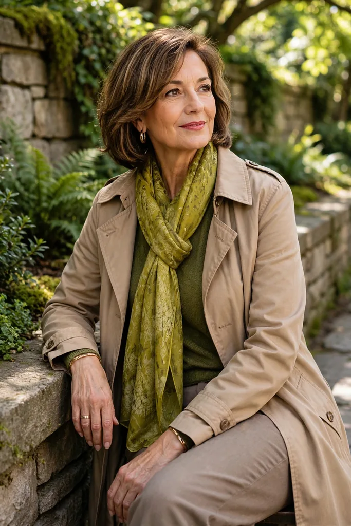
Green ranks among this year’s most interesting color developments, its two extremes sitting far apart on the comfort scale.
Designers sent out vivid lime and chartreuse for spring, then softened the message for autumn with moss, olive, and other earthier greens.
Women who love bold color will find chartreuse a surprisingly wearable accent.
Knot a vivid chartreuse scarf over charcoal outerwear or an electric green sweater over dark trousers, and stop styling there.
When those punchy shades feel too sharp, skip them without guilt.
Moss and olive tell that same green story more quietly, merging effortlessly with pieces hanging in a mature capsule wardrobe.
For errands or travel days, start with an ivory sweater and olive trousers — a relaxed foundation that asks for nothing more.
Loafers keep it neat, sneakers casual, ankle boots dressy — pick the pair that suits your day.
Swap the black or tan layer you grab on autopilot for moss instead.
Thanks to its earthy depth, the shade sits happily beside denim, chocolate, cream, burgundy, rose, and blues of every kind.
For 2026, this green combination keeps every piece familiar while the color story reads current: a warm stone-tan trench, soft moss knit, taupe trousers, and a chartreuse scarf at the neck.
That approach shows exactly why trendy outfits for women over 50 stay practical.
All the newness comes from color; every silhouette stays one you already know and trust.
Comfort upgrade:
If your closet runs mostly neutral, bring green in through a cozy knit, a silky scarf, or a laid-back jacket — not a sharply tailored statement piece. The color lands first, so the garment itself can stay completely low-key.
Carbon Gray, Midnight Navy, Cream: The Quiet Neutrals Grounding Every Bold Shade
Volume is not the whole story for 2026.
Per Pantone’s autumn/winter report, vivid shades sit in check beside calmer, grounded ones — while midnight tones, carbon gray, and creamy whites kept resurfacing.
Soft white earned its own spring spotlight: Cloud Dancer — the gentle off-white Pantone crowned its 2026 Color of the Year — kept appearing beside far brighter runway colors.
Those quieter tones earn their keep: stronger colors become far easier to wear.
Under brighter pieces such as cobalt, red, turquoise, or plum, midnight navy quietly takes over the job black used to do.
Yellow and purple sit more calmly on carbon gray than on black, which can hit too hard.
Keep cream closest to your face.
Whenever burgundy, moss, teal, royal purple, or bright blue feels too strong near your face, answer with a cream blouse, knit, blazer, or scarf to soften the entire effect.
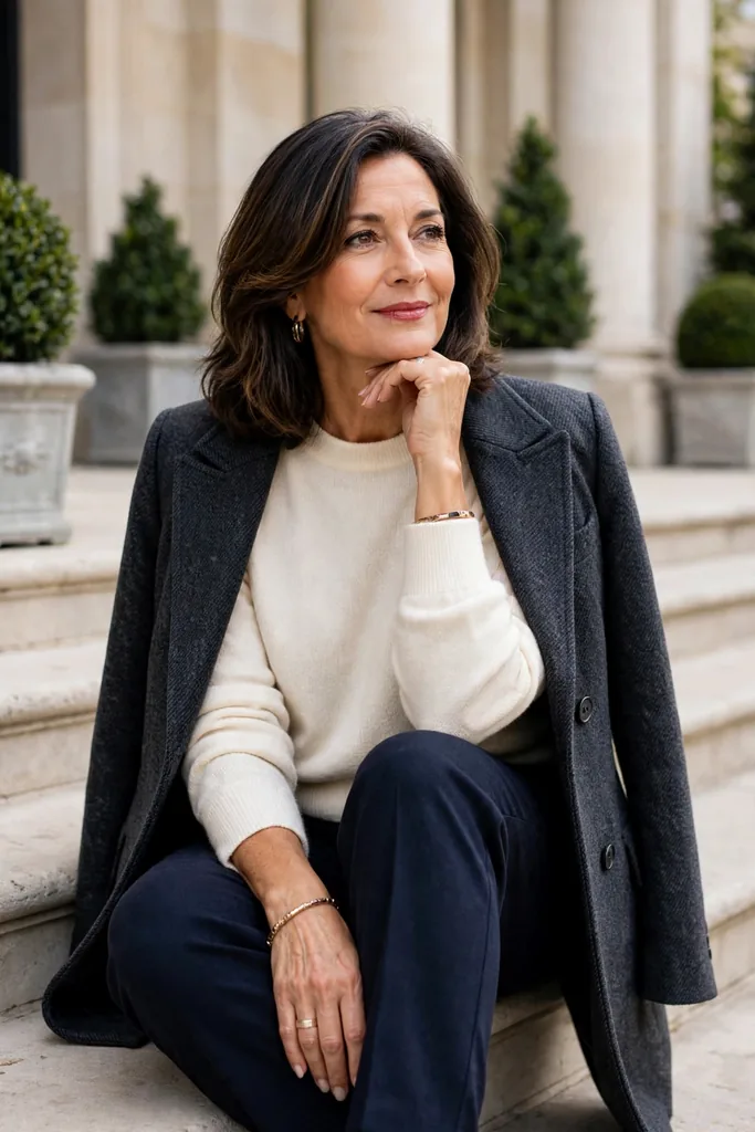
Fail-safe formula: carbon gray blazer, midnight navy trousers, cream knit underneath.
Interest comes from texture with these neutrals.
When the color stays quiet, let touch and weave carry the interest. A cream knit with a deep rib, wool with a brushed hand, denim in a dark rinse, satin kept matte, breathable linen blends, buttery suede, or cotton cut with soft structure — each one gives a neutral outfit something to say.
Quiet color and forgettable outfits are not the same thing.
When the fabric is good, the proportions are clean, and one stronger shade leads, the result beats any outfit piling on several competing trends.
Start With a Color You Love and Build Your Palette From There
Give every trend color a personal formula — nothing makes new shades easier to wear.
Think of it as three moves: a neutral you trust goes down first, one current shade goes on next, and the shoe or layer simply backs up the neutral.
Picture the formula in dark denim, a turquoise top, and tan loafers — the familiar base frames the look while the top supplies the freshness.
The method holds up equally for casual days, smart casual plans, work, and evening dressing.
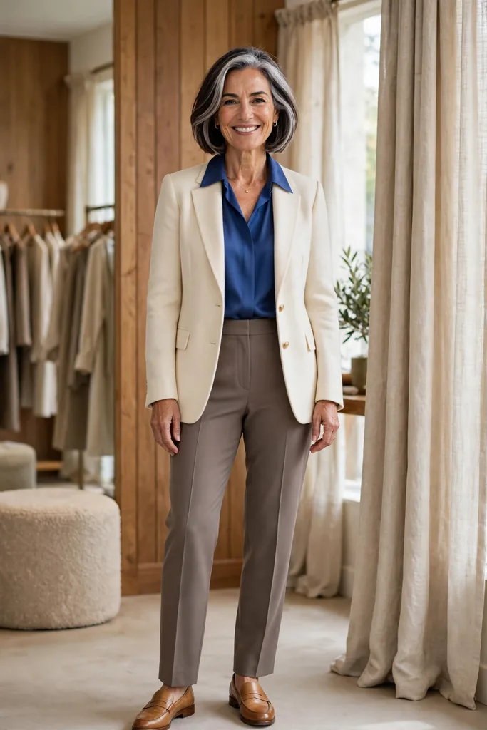
For a polished take on this formula, try a warm ivory blazer over a royal sapphire blouse with taupe trousers and tan loafers. One vivid note does the talking; everything else stays calm.
When a combination clicks, wear it on repeat.
Small swaps keep it fresh: a different blouse, new shoes, a rolled sleeve, an added scarf, or jeans in place of trousers.
A dependable formula beats endlessly hunting for something new to wear.
Mornings get easier, yet plenty of room remains for style confidence over 50.
Let one simple question guide your next trend purchase:
Will this shade earn its place beside three things you already own?
A yes means the piece will likely earn its place in your rotation — and pay back with a strong cost-per-wear.
| Setting | Formula to Try | What Makes It Work |
|---|---|---|
| Errand day | Dark denim, butter-yellow knit, white sneakers | Gentle color keeps a well-worn base feeling new |
| Lunch out | Cream trousers, plum blouse, tan loafers | A dark-light pairing that feels polished, never heavy |
| Office day | Charcoal trousers, cobalt shirt, navy blazer | Supporting neutrals step back while one strong blue leads |
| On the road | Olive trousers, cream knit, turquoise scarf | Comfortable staples gain their color with no added bulk |
| Evening out | Black trousers, red blouse, simple metallic jewelry | A single bold shade carries the whole evening |
Formula:
a neutral you trust + one 2026 shade + a quiet finishing piece
FAQs
What’s the color story for 2026?
The headline shades for the year break down like this: vivid and icy blues plus turquoise; royal purple and plum; a warm red story told through vivid red, butter yellow, and peach; chartreuse and olive for green; and a grounding crew of cream, midnight navy, and deep gray. Brighter for spring, richer and darker for autumn — that seasonal shift is the whole story. No need to collect them all — keep just the few that feel at home beside the neutrals already hanging in your closet.
Which trend shades work best if I mostly wear neutrals?
Blue, plum, burgundy, olive, and butter yellow are the easiest entry points — every one of them settles beside everyday wardrobe neutrals. Any of those shades sits beautifully on a base of navy, gray, cream, denim, camel, chocolate, or black. If your wardrobe holds almost no color, start small — a single knit, blouse, scarf, bag, or shoe — instead of redoing whole outfits. Build from easy pairs before chasing statement pieces.
Are bold, bright shades really off-limits after 50?
Absolutely — age sets no rules about color. What flatters you is deeply personal, not generational. What actually matters is the fit: the shade against your coloring, your comfort wearing it, and how it sits with the wardrobe you own. Take cobalt, red, purple, turquoise, or chartreuse — each one looks polished when the silhouette stays clean and everything else stays quiet.
How do I judge whether a trendy shade will flatter me?
Hold the shade up to your face in daylight and take in the whole picture instead of auditing undertones. Daylight never lies the way store lighting does. If the mirror shows you brighter and more defined, keep that shade close to your face. Love a color that will not love your face back? Then keep it below the neck. Trousers, skirts, shoes, bags, belts, and even accessories all carry the color beautifully.
What’s the right number of trend colors for a capsule wardrobe?
Any number can work — the count is not the point. A color or two that blends with pieces already in your closet beats six shades that each insist on their own outfit. Judge by repeat wear instead: a plum cardigan that works with cream, denim, gray, and brown will earn its keep far sooner than one dramatic piece you can style a single time. Versatility beats novelty every time.