
When Your Go-To Color Stops Loving You Back: A Shade Guide for Women Over 50

There is a peculiar frustration in opening the closet to clothes that still fit beautifully — pieces that once earned compliments — and finding they now leave the face looking flat or tired. Nothing about the garment changed; the chemistry between the shade and your complexion did.
Silver threads through the hair; the definition around brows and eyes goes quiet; skin lets go of some pink and gold. A sweater that once framed you may start competing with your face instead of flattering it. This is no signal that women over 50 should shrink into a handful of ‘safe’ colors. When dressing over 50, the real skill is spotting which hues return the face’s clarity — then making a few careful swaps in undertone, depth, and contrast so the whole wardrobe looks fresher.
Table of Contents
- Why a Once-Loved Shade Can Turn on You at the Mirror
- Beige, Camel and Taupe Only Work in the Right Undertone
- Black Still Has a Place — If You Give It a Softer Frame
- Pale Pastels Can Make You Disappear Instead of Glow
- Brights Flatter Most When Their Energy Matches Yours
- White Works Wonders — Once You Find Your Version
- Anchor Every Outfit in Two or Three Trustworthy Face Colors
- Wrong Shade at the Face? Move It Down and Away
- FAQs
Why a Once-Loved Shade Can Turn on You at the Mirror
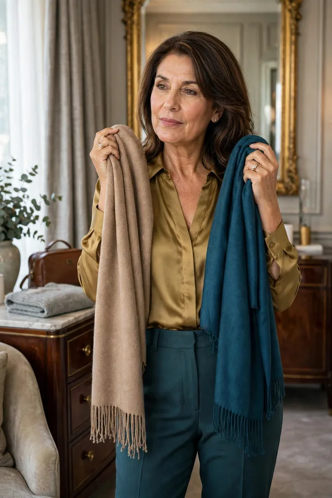
Let me say this plainly: no shade turns traitor because of a birthday. The real change is the give-and-take between a shade and the wearer — and it never stops evolving.
Silver threads through the hair, or the whole head drifts lighter; brow contrast fades a notch; skin lets go of some pink, gold, or deep saturation. Then a beige knit, a frosty pastel, or a hard-edged black top starts pulling the eye off your face instead of toward it.
Diagnosis takes no expertise — face first, garment second. Hold a suspect top near your chin and watch what registers first. If shadows, redness, grayness, or patchiness jump out before the outfit does, that color fights you more than it flatters you.
The right shade does the opposite. Eyes look sharper, skin reads more even — the effect lands before the clothes themselves register.
The quick guide below works as a decoder — five common mirror moments, what each usually signals, and the simplest adjustment.
| What the mirror shows | What is probably going on | Your next move |
|---|---|---|
| A gray cast over the skin | The shade hugs your skin tone with too little richness of its own | Give the shade more depth, more saturation |
| More visible redness | The shade may be doubling orange-red undertones best softened | A cooler, calmer take on the family |
| Shadows beneath the eyes look heavier | An overly dark shade weighs down the face | Trade it for a mid-depth tone, less bite |
| Your face fades into the outfit | The look lacks the contrast your features need | Reinforce the neckline: scarf, collar, jacket |
| The outfit registers before you do | The shade’s volume is louder than your coloring | Keep the hue, soften the intensity a notch |
No studio lighting or paid color analysis required. Plain daylight beside a window tells you everything.
Beige, Camel and Taupe Only Work in the Right Undertone
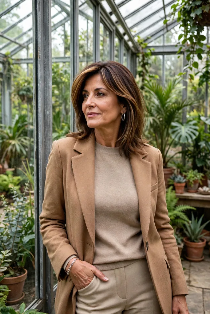
Dull complexions past fifty get blamed on neutrals constantly, yet beige itself is rarely guilty — nine times in ten, the undertone did it.
A camel cut with too much yellow can turn skin sallow. Gray-dominant taupe robs warmth from deeper-neutral devotees.
Notice the camel blazer in the photograph above — its warm-but-balanced cast lands in the sweet spot, proving the family itself is innocent. Banishing neutrals is rarely the answer; nudge warmer, cooler, lighter, or deeper instead. When pale oatmeal hollows your face, call on the rescue squad: mushroom, cocoa, soft navy, warm stone, olive, charcoal — each ready to hand the glow back.
Shade tip: press the neutral to your bare face, then compare. If your skin reads clearer unclothed and dimmer the moment the fabric goes on, that version of the family is not yours — audition another.
Distance helps too: a beige that drains as a crewneck can turn ally as trousers, a skirt, a handbag, or shoes — the farther from the face, the kinder the shade.
That distinction carries the whole philosophy: dressing over 50 works best when you spend your wardrobe cleverly instead of exiling entire color families.
Black Still Has a Place — If You Give It a Softer Frame
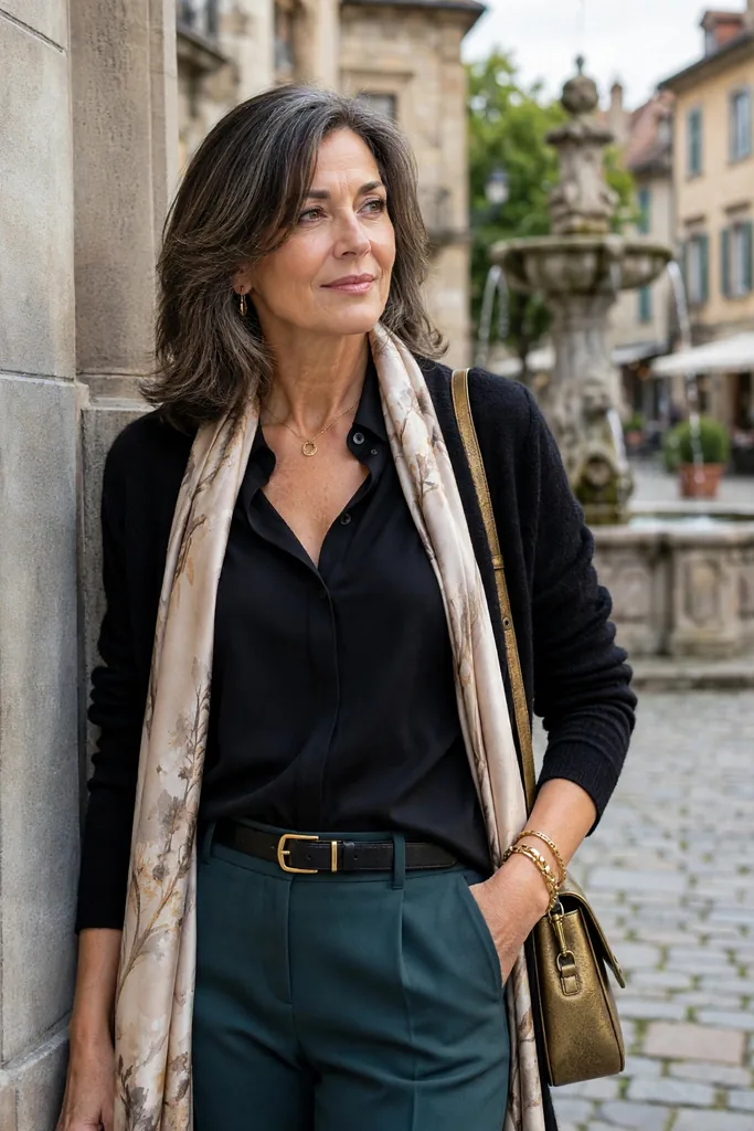
Nobody is asking you to surrender your black. It pairs with everything, packs like a dream, and carves out one of the cleanest silhouettes in any closet.
Still, an unbroken wall of black beneath the chin can spotlight shadows and exaggerate every small shift in your skin’s contrast. That is a styling problem to solve, not a farewell letter to write.
Change which pieces touch your face first:
- Pair dark trousers, jewel-tone blouse: deep teal, berry, ivory, true blue.
- Let earrings, scarves, or an open jacket in a gentler tone interrupt the dark dress.
- Charcoal, ink navy, espresso, and deep olive each take the edge off considerably.
- Open up the neckline, leaving a generous skin buffer between the face and all that dark cloth.
The patterned scarf in the photograph above does exactly this — a softer frame breaking the black at the throat so the face takes center stage.
Stay loyal to the black that leaves you feeling sharp and self-assured. Your own mirror outranks any generic color decree.
For the same depth minus the severity, the comparison below earns its keep.
| When black feels… | Swap in… | Why it flatters |
|---|---|---|
| Jet black feels stark | Charcoal | All the depth, gentler contrast |
| Black-brown falls flat | Espresso | Warm, never washed-out |
| Navy-black looks muddy | Ink or midnight navy | Rich and versatile |
| The stark monochrome pairing | Let cream do the softening | Takes the edge off around the face |
| An all-black column overwhelms | Dark foundation, one colorful layer on top | A sleek foundation plus face-level color |
Handled this way, black stays the backbone of stylish outfits for women over 50 — rethink only what sits in the top third.
Pale Pastels Can Make You Disappear Instead of Glow
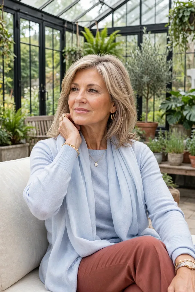
Those whisper-soft pastels — powder pink, pale lavender, and their frosty blue and faded mint cousins — are beautiful colors, every one. Certain pastels lack the depth to stand apart from skin, and the garment ends up wearing you.
As hair silvers and facial contrast eases, this vanishing act grows obvious — a pastel that glowed at forty can fall strangely quiet at sixty.
The fix is rarely to abandon the color — step one or two rungs deeper. Trade baby pink for its dustier rose cousin, swap icy blue for periwinkle, and let washed-out lilac deepen into plum or violet.
Same logic covers greens: watery mint can look anemic; sage, eucalyptus, jade, or muted teal restores definition to your features.
The photograph above shows the classic test case — a pale blue knit and scarf at the face, the exact spot where pastels reveal whether they glow or disappear.
The chin test: lay two versions of one color at the jawline — a pale one against a deeper one — studying eyes, skin, not the cloth. The right depth usually announces itself within seconds.
Brights Flatter Most When Their Energy Matches Yours

First, one myth to clear: nobody past fifty owes beige, navy, and gray a retreat. A confident wearer makes strong color look spectacular.
What trips people up is intensity, not color itself. Neon coral, electric lime can outshout softer natural coloring — the shirt registers before you do. Razor-sharp cobalt does the same.
The vivid orange-red shirt in the photograph above proves the point: strong color is never the enemy — calibration is everything.
The fix is finding a better-balanced sibling of the same hue. Let vivid orange mellow toward terracotta and paprika, bring hot pink down to raspberry. Greens can go deeper too — emerald, moss, pine.
Think of it as tuning the volume rather than dulling the outfit — setting it where your coloring can sing along.
A few real-life translations, from errands to dinner:
| Occasion | The base | The swap | Why it works |
|---|---|---|---|
| Errands | Denim, soft knit, sneakers | Raspberry knit instead | Same energy as neon pink, gentler at the face |
| Lunch out | Trousers, a soft blouse, flats | A teal blouse instead | Rich color without shouting |
| Easy workday | Dark denim, a cardigan | An olive cardigan instead | Modern and grounded |
| Dinner | Black trousers plus a soft blouse | A burgundy blouse instead | Drama, but deeper |
| Travel day | Neutral trousers, plus a jacket | A rust jacket instead | Warm, mixes with ease |
None of this means muting everything — some women shine brightest in vivid color. Let your reflection referee: brighter eyes, livelier skin, and the color earns its place.
White Works Wonders — Once You Find Your Version

White looks simple and behaves complicated. Optical white, soft white, cream, ivory, ecru — each sits on the face differently, and the gaps between them matter.
White with a blue cast throws a hard edge at the face. On some faces it reads crisp and commanding; elsewhere it leaves everything nearby looking warmer, redder, more tired.
Cream plus ivory hands off more gently against camel, brown, muted green, soft denim, brass jewelry. The ivory shirt in the photograph above shows the right version doing its quiet work.
Never assume warmer means kinder with white — if cream casts your skin yellow, the cleaner white may be your ally.
Fabric clue: the cloth itself can rescue a white. Linen, brushed cotton, ribbed knits, and matte weaves scatter light differently than stiff, glossy cloth — which explains why two shirts can act as strangers on one body.
Anchor Every Outfit in Two or Three Trustworthy Face Colors
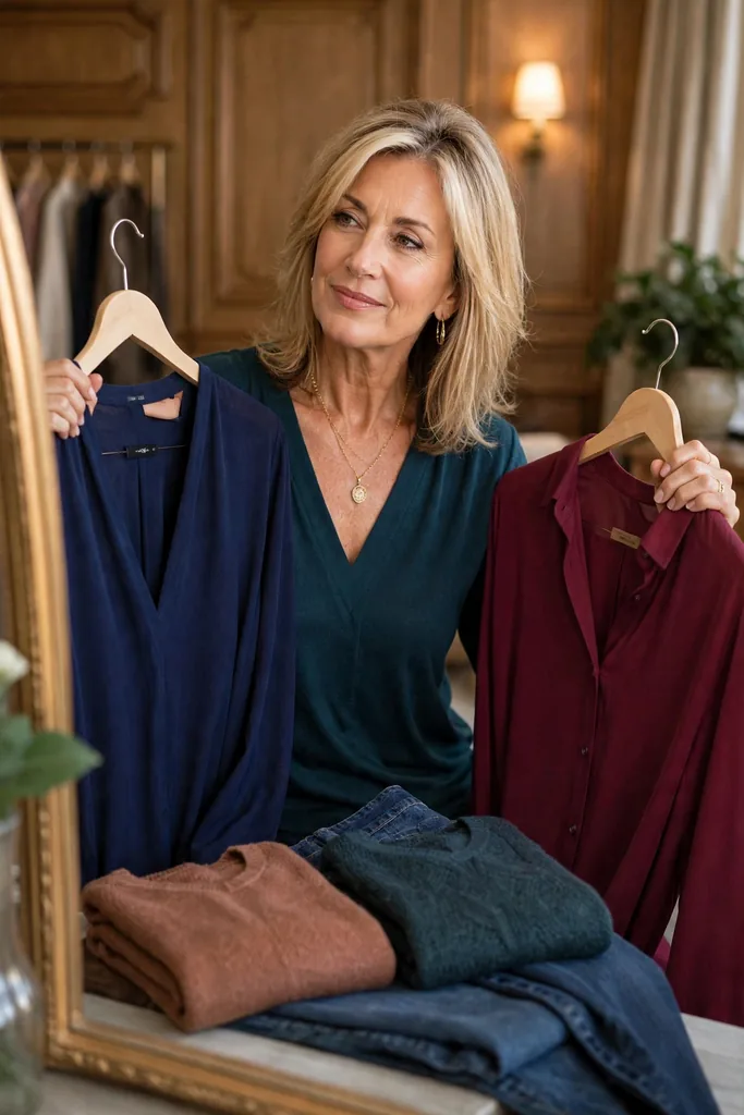
Forget memorizing a twelve-season color wheel. Smarter dressing starts with something far simpler.
Pin down two or three shades that leave the complexion looking clear — call them ‘face colors,’ the ones to reach for in tops, scarves, jackets. Think navy, teal, ivory, or raspberry to start — each one a proven face-framer in its own right. Or chocolate, olive, plum, soft blue, burgundy — the rest of the list is yours to write.
The trio of garments in the photograph above — a navy blouse, a teal knit being worn, a burgundy shirt — is a face-color wardrobe in miniature: three proven shades, endlessly remixable.
Everything else in the closet stays gloriously flexible.
Here is one way to write your personal formula:
Formula: a face shade you love + a trusted neutral + one echoing accent tone
Picture it in action: teal knit, dark denim, tan loafers, the tan echoed in belt or bag — suddenly it clicks.
The jeans and loafers earn a second outing under a berry blouse. That is the quiet payoff of dressing this way: new color on top, same simple logic underneath.
It also protects your budget — every new piece must earn its place beside colors you already trust.
Wrong Shade at the Face? Move It Down and Away
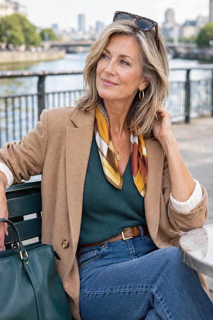
Here is the most liberating reframe in this guide: ‘this color does not suit my face’ is not the same sentence as ‘I cannot wear this color’.
Mustard may tire your complexion, yet a mustard handbag can remain a favorite. Pale beige may drain your cheeks, yet beige trousers can quietly become a hardest-working basic.
The striped scarf in the photograph above demonstrates the rescue move — a lively pattern at the face, turning a tricky palette into an asset.
A few small reframes can rescue pieces already hanging in your closet:
- Perk up a blah sweater by letting a flattering collar show beneath it.
- A fading frock steadies with a jacket or scarf at the throat.
- When one shade in a beloved print fights you, echo its kinder color in accessories.
- A harsh-feeling dark top relaxes once the neck opens and earrings brighten.
Color guidance should be a toolkit, not a rulebook. Real style confidence over 50 means adjusting an outfit to suit you — never feeling bossed around by it.