
Glow After 50: The Warm Colors That Bring Your Skin to Life
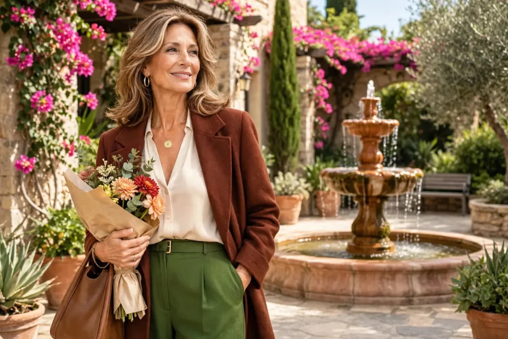
Even the most beautiful outfit can disappoint when the shade resting against your face leaves you looking pale and faded. The sting sharpens once the colors you once reached for on autopilot stop flattering you the way they used to.
Past fifty, new hair color, a lighter makeup hand, and lower natural contrast all shift how clothing shades read on your skin. A warm undertone can stay warm while the exact colors that flatter it need small recalibrations.
Better color has nothing to do with pledging allegiance to a seasonal chart. The moment your wardrobe starts working alongside your natural coloring instead of competing with it, putting together stylish outfits for women over 50 becomes noticeably simpler.
Table of Contents
- Put the Most Flattering Shades Right by Your Face
- Why Warm Neutrals Are the Easiest Base to Build On
- Earth Tones That Warm Up a Look Without Shouting
- The Warmer Side of Red, Pink, Green, and Blue
- Too Cool? Swap the Shade, Not the Color
- Let Jewelry, Prints, and Accessories Tie It All Together
- A Repeatable Outfit Formula for Warm Colors
- FAQs
Put the Most Flattering Shades Right by Your Face
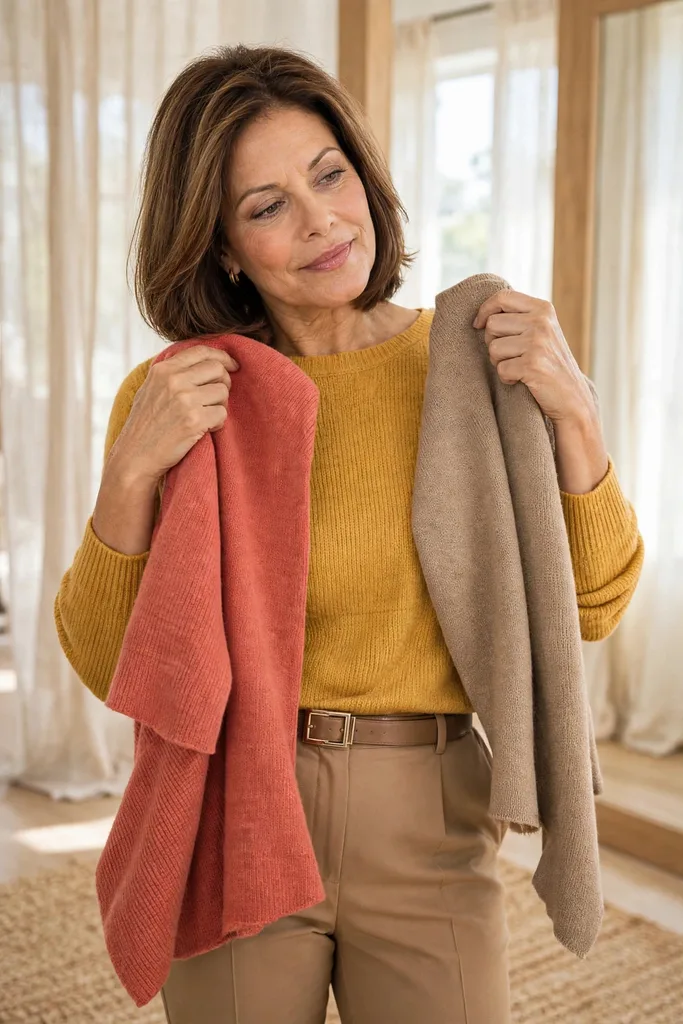
Golden, honeyed, peachy, olive, and earthy casts tend to be kind to warm undertones, but a warm-sounding name on a tag guarantees nothing about your own face.
In daylight, test two near-twins at your jawline and note which smooths your complexion and wakes your eyes. Bright white against ivory, or cool raspberry against warm coral, makes a perfect starting pair.
Old shortcuts deserve skepticism. Vein color, and the claim that gold jewelry automatically proves warm undertones, are starting points at best; fabrics held to your actual face tell the truth.
Hair rewrites the frame. Gray, silver, highlighted, red, brunette, or blonde each reframe the light around your features, so your best palette can soften, deepen, or brighten a notch even while your warmth stays put.
Give this a go: Arrange five favorite tops where daylight pours in, then photograph yourself wearing each. Comparing the images side by side makes the strongest shades jump out.
Repeat the exercise whenever your hair color changes — a new silver grow-out or a fresh dye job can quietly move the goalposts, and ten minutes of photos beats an afternoon of returns. Morning light is the most honest; warm evening bulbs flatter everything and teach you nothing.
Why Warm Neutrals Are the Easiest Base to Build On
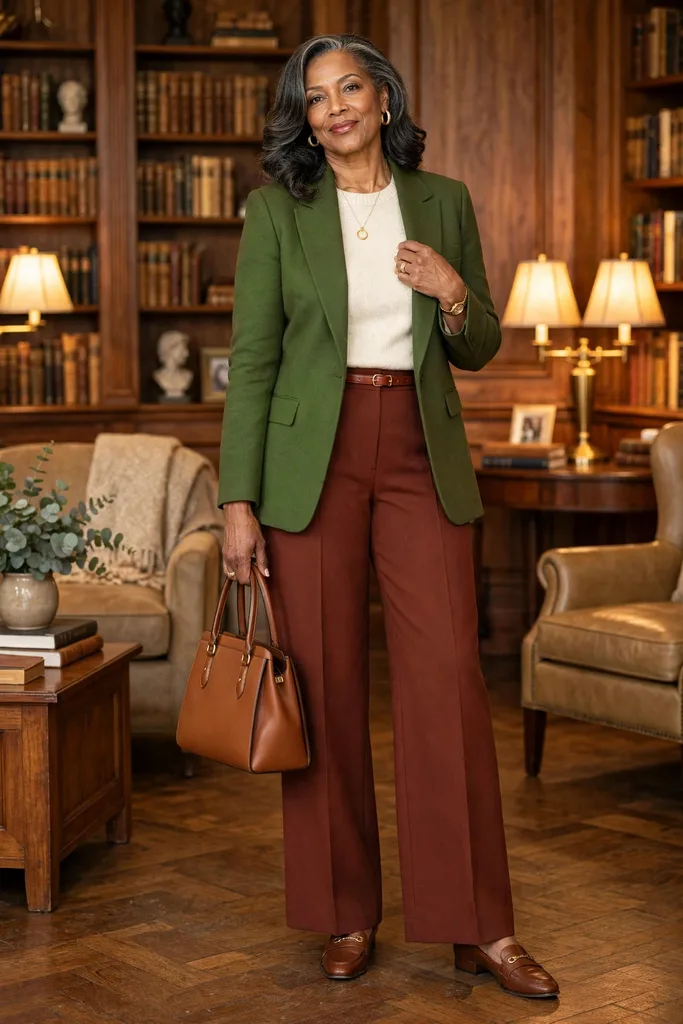
The real workhorses of a warm wardrobe are seldom the showy shades. Cream, camel, chocolate, warm taupe, tan, and soft olive form a base that harmonizes with nearly everything.
Their strength lies in blending — no harsh edges — while letting denim, prints, jewelry, and bolder accents take the spotlight.
Keep your black staples below the neckline and let a warmer shade do the talking up top.
One practical way to assemble the palette looks like this:
| Warm Neutral | What to Look For | Pairs Easily With |
|---|---|---|
| Ivory | Soft white with a buttery, creamy cast | Olive, camel, rust, dark denim |
| Camel | Golden-brown middle tone, not too orange | Chocolate, ivory, teal |
| Warm taupe | Beige-brown with genuine warmth, never ashy | Coral, cream, olive |
| Chocolate | Deep brown with enough richness to replace black | Rust, peach, teal |
| Soft olive | Muted green carrying yellow or brown warmth | Warm navy, ivory, tan |
That repeatability is exactly why these shades anchor a capsule wardrobe over 50 so well. One camel jacket, an ivory knit, chocolate trousers, and an olive overshirt can rotate through weeks of outfits without repeating themselves.
A note on fabric: pick matte wool, brushed cotton, suede, linen blends, or soft knits to keep tones at their richest. Shiny finishes, though, tend to amplify camel, bronze, and mustard beyond what you planned.
Gather every cream, camel, chocolate, and olive piece you own for a side-by-side review — the foundation of your new palette may already hang in your closet, waiting for one or two deliberate additions.
Earth Tones That Warm Up a Look Without Shouting
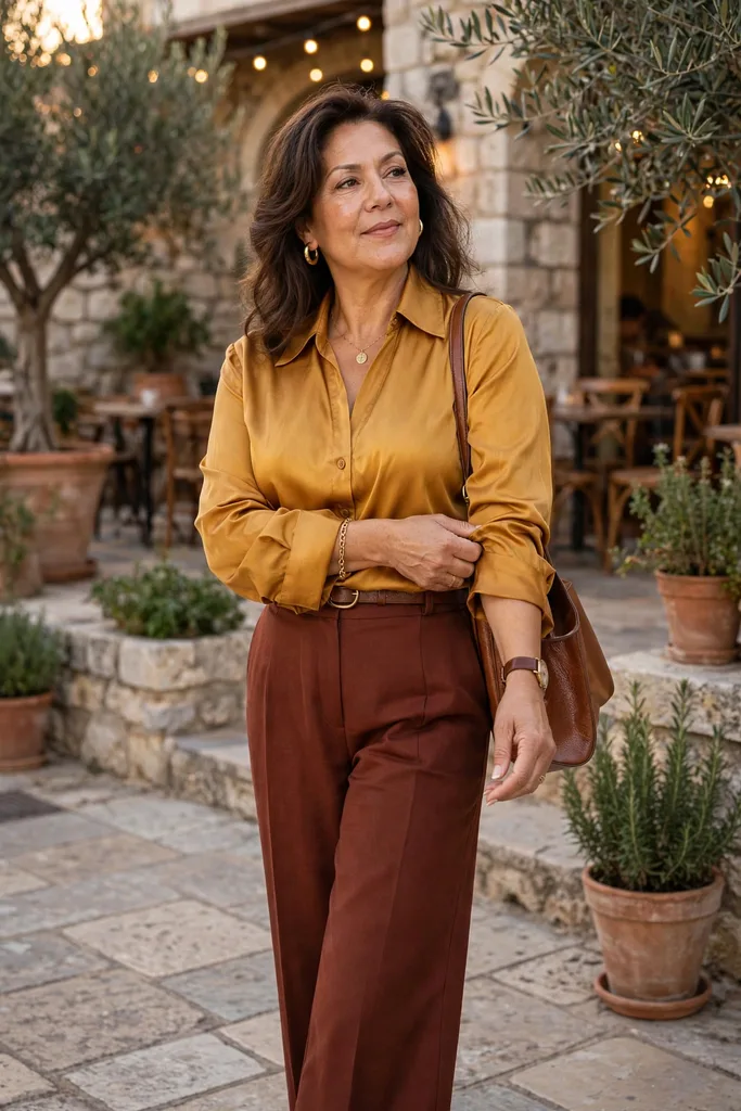
Terracotta, rust, paprika, cinnamon, ochre, and burnt orange are made for warm undertones — a brown or golden heart keeps them gentler than sharp primaries.
No need to commit head to toe; a single earthy piece often carries the whole outfit. Try a rust cardigan over an ivory top with dark denim, or terracotta trousers sharpened up with cream knitwear and tan loafers.
Deploy ochre through accessories — a scarf, jacket, print, or handbag — when a full mustard sweater would overwhelm.
Combinations worth experimenting with:
- Terracotta over ivory, finished with cognac accessories
- Rust with dark denim, grounded by camel
- Olive with cream, deepened with chocolate
- Paprika with warm navy, softened by tan
- Cinnamon with soft beige and gold jewelry
The secret is proportion: one richer shade brings the personality while quiet neutrals keep the whole thing composed.
If these shades ever feel like too much, shrink their footprint. Keep the earth tone to your lower half or to one accessory, and let quiet neutrals hold the space nearest your face.
Craving extra color without sacrificing polish? This approach usually lands you at chic outfits for women over 50 sooner than any other.
The Warmer Side of Red, Pink, Green, and Blue
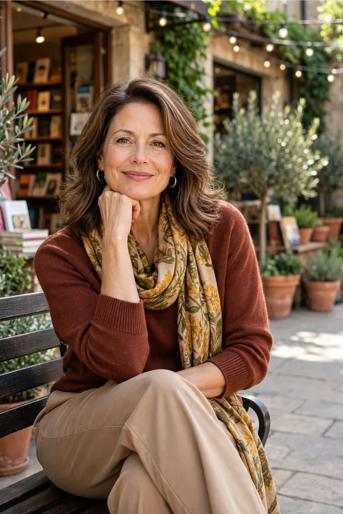
A warm undertone is no life sentence to beige and brown — simply choose the version of each color with warmth or softness folded in.
Blue-based cherry gives way to tomato, brick, or poppy red; icy pink gives way to peach, salmon, coral, or warm rose.
Few color families forgive as readily as green. Warm undertones love green in its earthy forms: olive, moss, khaki, warm forest green, avocado tones.
Blue takes more trial and error. Still, teal, turquoise, petrol, peacock, and warm-leaning navy shades tend to flatter golden undertones.
A note on color names: Judge the shade, not the label — two “navy” sweaters can hide opposite undertones. Audition each blue against cream, camel, and olive — harmony there means it will play nicely in your warm wardrobe.
A handy cross-check: your warm red lipstick. If a garment’s red echoes the lipstick shade that flatters you, the undertone is almost certainly right — a tiny makeup clue that saves fitting-room guesswork.
Too Cool? Swap the Shade, Not the Color
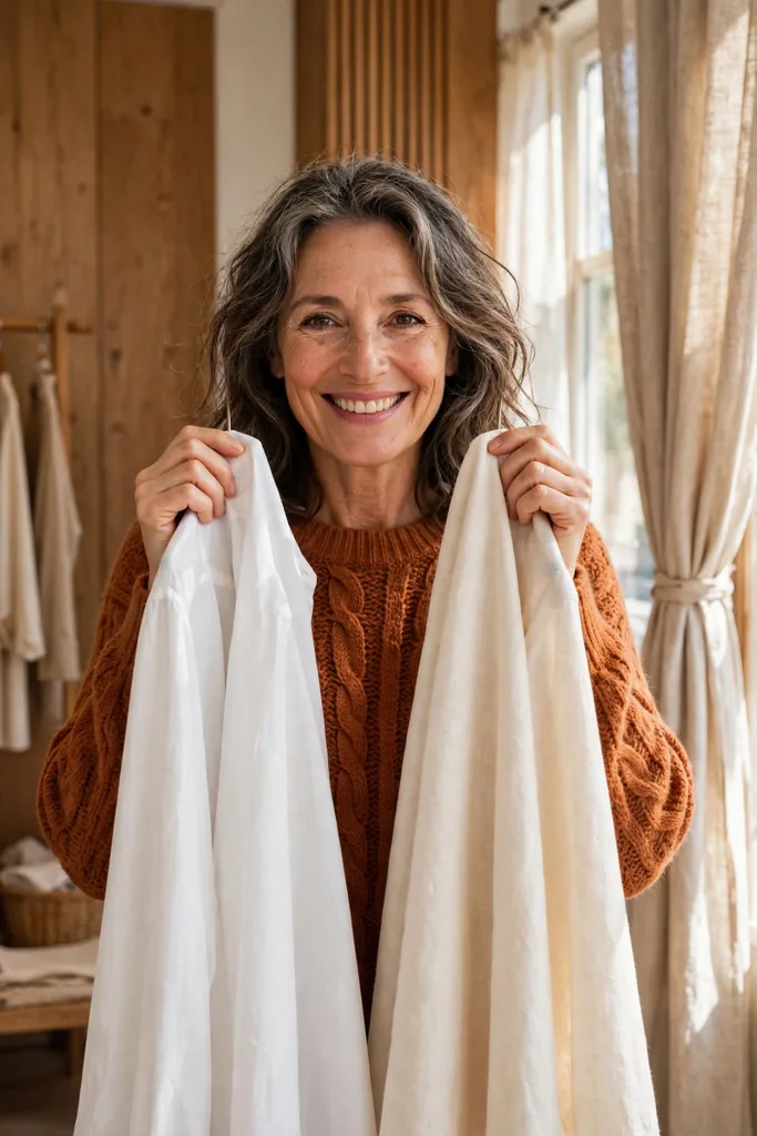
The moment color guidance reads like a list of prohibitions, it stops being useful. Reject that framing.
Nearly every color family spans warmer and cooler members, so a small shift in shade usually resolves the clash.
This comparison travels well — bring it shopping or use it during a closet audit:
| Feels Harsh Right Now | Reach For Instead |
|---|---|
| Cool purple | Aubergine or plum with a reddish base |
| Icy pastel blue | Muted turquoise, teal, or petrol |
| Stark optic white | Soft ecru, cream, or ivory |
| Blue-red berry | Coral red, brick, or tomato red |
| Icy baby pink | Warm rose, peach, or salmon |
| Cool charcoal | Brown-gray, chocolate, or warm taupe |
Keep wearing the cool shades you adore; position them below the neckline instead. Cool-gray trousers glow beside an ivory blouse, and a lavender skirt settles happily with camel shoes and a warm cream knit.
The fitting-room comparison above is the method in miniature: optic white held beside ivory against real skin makes the flattering choice obvious.
Keep a running swap list in your phone’s notes app. Photograph the pairs that win your comparisons, and consult the list while shopping — it turns vague instinct into a concrete reference. Date the entries; your eye will sharpen over the season and the list becomes a personal color diary.
These small tunings keep dressing over 50 feeling like freedom rather than obedience. Think of color as a dial to tune rather than a commandment to obey.
Let Jewelry, Prints, and Accessories Tie It All Together
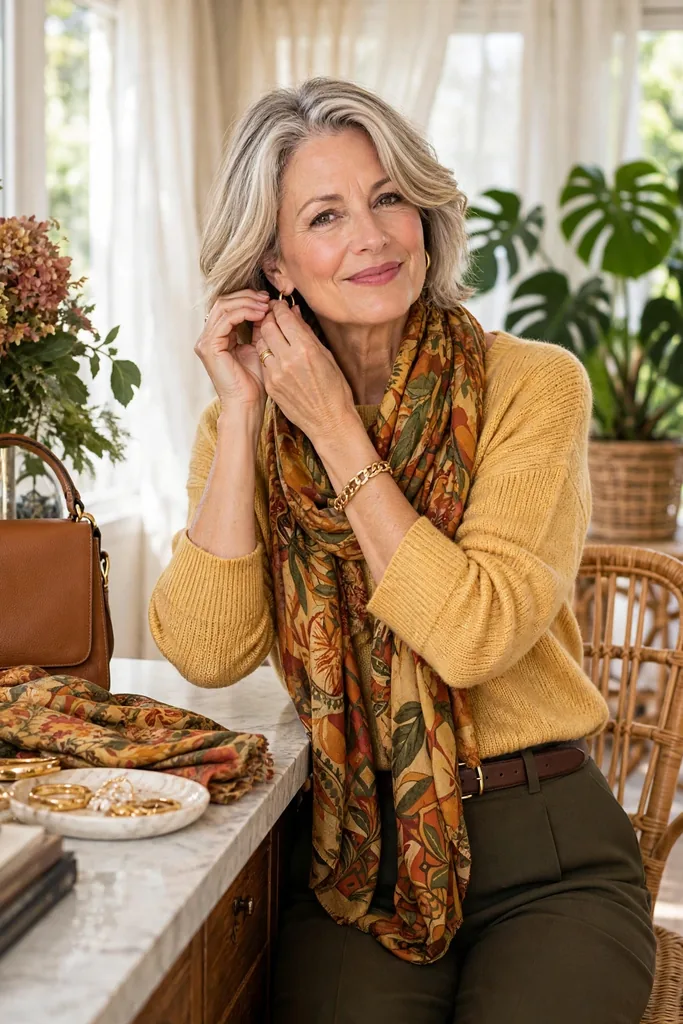
Accessories save the outfit that feels ninety percent right.
Gold, bronze, brass, copper, tortoiseshell, cognac leather, warm tan all rest easy in warm company. Mixing metals works too — many of us already layer gold with silver daily.
Prints serve as another bridge. One scarf weaving navy, rust, ivory, and olive can pull together pieces that would otherwise feel like strangers.
Evaluate any print by the color nearest your face — when the background flatters, the smaller cool accents inside barely register.
The budget-friendly move: Skip the stores and audition fresh jewelry or a different scarf against an outfit you already own — sometimes one warm accent finishes the job.
Pay special attention to earrings and necklines — they sit closest to your face, so a warm metal or warm-toned pendant there does more connecting work than a handbag ever could.
That same trick makes stylish outfits for women over 50 endlessly repeatable: hold the simple base steady and refresh the details.
A Repeatable Outfit Formula for Warm Colors
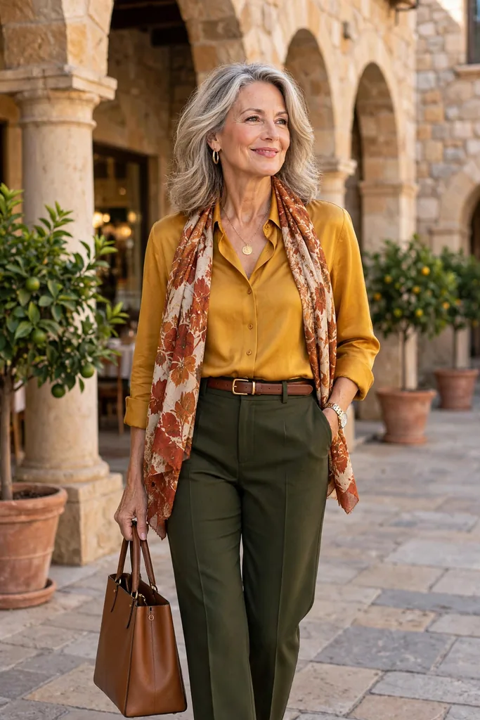
A good palette proves itself on hectic mornings — no color wheel required before coffee.
Take one warm neutral as your base, invite a supporting color in, and crown it with a richer accent when you’re in the mood.
Several ready-made formulas, built from pieces you may already own:
| Occasion | The Pieces | Why It Flatters |
|---|---|---|
| Casual dinner | Dark denim, rust blouse, gold jewelry | Rust commands attention while everything else stays quiet |
| Everyday errands | Dark denim, ivory knit, camel jacket | Warmth hugs the face while denim keeps it relaxed |
| Travel day | Olive trousers, oatmeal knit, cognac shoes | Earthy neutrals pack well and forgive creases |
| Lunch with friends | Chocolate trousers, coral blouse, tan loafers | Coral adds life; brown keeps it grounded |
| Smart casual | Warm-navy trouser, cream top, olive jacket | Gentle contrast without any harshness |
Formula: warm neutral base, flattering near-face shade, one connecting accessory — your reliable base trio.
Chocolate trousers, an ivory blouse, and cognac loafers make one example; trade the blouse for coral or teal tomorrow and the structure still holds.
Another favorite: olive trousers, a warm-sand knit, and a printed scarf in saffron and rust for weekends — same skeleton, entirely different mood.
That repeatability is the real prize: color stops being a pile of rules and starts behaving like a wardrobe that runs itself. Write your three or four winning formulas on a card inside your closet door — decision fatigue disappears when the answer is already written down.
FAQs
How can I tell whether I truly have warm undertones?
The most reliable check is a fabric comparison in natural daylight. Hold two close shades under your chin — for instance, bright white beside ivory, or cool raspberry beside warm coral — and watch which one evens out your skin and brightens your eyes. The shade that looks softer and more “you” is your answer; vein color and jewelry rules are only rough hints.
Black looks harsh near my face now. Do I have to give it up?
Not at all — just move it away from your face. Keep black trousers, skirts, boots, and handbags, and let a warmer shade like ivory, camel, or coral carry the top half. The black still reads as sleek without draining your complexion.
Which neutrals work best as the base of a warm-undertone wardrobe?
Cream, camel, chocolate, warm taupe, tan, and soft olive are the workhorses. They blend without clashing, make denim, prints, and jewelry easier to combine, and repeat endlessly in a capsule wardrobe — a camel jacket, ivory knit, chocolate trousers, and olive overshirt can spin out dozens of outfits.
Do I have to give up cool colors like blue or pink entirely?
No. Most color families have warmer and cooler members, so swap the shade instead of abandoning the color — teal for icy blue, coral for cool pink. And a cool shade you love can stay if you move it farther from your face, like a cool-gray trouser worn with an ivory blouse.
How do accessories help pull warm colors together?
Gold, bronze, brass, copper, tortoiseshell, and cognac leather merge naturally with a warm palette, and a printed scarf can bridge pieces that feel disconnected. Judge any print by the color closest to your face — with a flattering background, the smaller cool accents inside rarely matter.